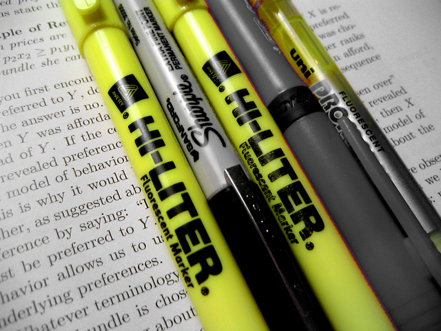
No question there's yellow here, but it seems almost overwhelmed by the black. I think having a coulde of lines highlighted (in yellow of course) would have made this a stronger statement.
Some highlit text would add here. The light needs to be more diffused to eliminate glare. Also, the composition is problematic as is the slightly our of focus text. A 5.







 Add photograph to your favorites
 Add photographer to your favorites


 Photographer found comment helpful.

