Challenge:Rhythm (Classic Editing) Camera:Kodak DX3900 Location: McGavock High School Football Field Date: Feb 13, 2003 Aperture: F 6.7 ISO: 100 Shutter: 1/125 Date Uploaded: Feb 16, 2003
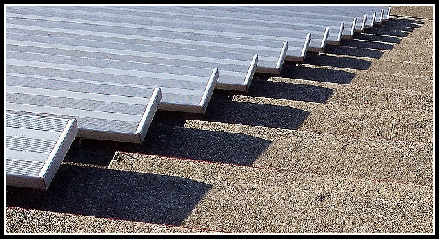
Composition: The diagonal alignment is a nice composition. I loaded your photo to my image editor and I cropped a bit more from the right just so that the end of the rows of seats is in the upper right corner. Personally I think that would improve the photo and makeit more powerful. I think this also would have allowed you to incease the height of the final image. It looks a bit small like it's now.
Lighting: It's a little bit too light for my taste, but that's personal preference. Also a nice twist would have been to decrease the saturation of red and only leave the blue tones of the seats saturated. But people think differently on this kind of modifications.
Focus: Focus is good. Maybe a bot too good, because the photo suffers immensly from the so called moiree effect. I guess you know what I mean. I also struggled with that effect before and I think adding a little blur before downsizing the image helps a bit. Recently there was a discussion about that topic in the DPC forum with more useful tips. Unfortunately I don't find the link now.
Challenge: Yes it fits to the challenge theme. The title suggests a double meaning regarding "rhythm". First the repetitive pattern and second that the pattern looks like piano keys. Well, with some imagination you can see a similarity to piano keys but I think it's not very striking ;)
Creativity: The photo is not particularly unique or inventive but nevertheless you had a good "photography eye" seeing this perspective.
Feel free to email me if you want to discuss the photo more. I also can send you a copy of the image with the modifications I described above (cropping, colours).
You are right they look like piano keys. The angle is wonderful, great composition here. The shadows really make for the black keys on a piano, I like this very much.
Excelent title!!! a piano is the first thing I thought of when I glanced at this photograph. Well done!! Great lighting, composition, and depth of field!
I like the crop on this shot, and I think the subject works very well. I think the title is too over the top (but that's not the type of thing I'd take off points for). Solid photo. 7







 Add photograph to your favorites
 Add photographer to your favorites


 Photographer found comment helpful.


