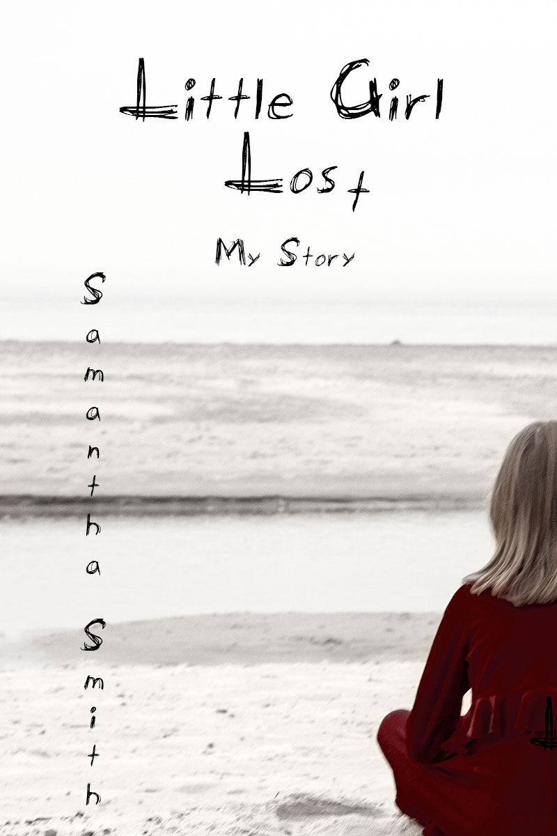
The photography and font types for a book with this title are perfect. There's another one in this challenge with the same title with a completely different feel to it -- and both are excellent. There's something about showing just half the girl that I think adds to the mood. It really works for me.
I like the creative design and composition. One of my pet peeves is when a font that is supposed to look handwritten has letters that look the exact same - so that's a small personal thing but overall the image and type work well.
THIS is what a book cover would look like IMHO. Not always a "perfect" photo and with a little mystic to it. Your choice of font is interesting and not one I think that's in my list of a gazillion. :-) Hope you share what it is?





 Add photograph to your favorites
 Add photographer to your favorites

 Photographer found comment helpful.


