Wow! This is awesome Sarah. I really like the way the picture itself leads the eye from the bridge and reflection to the palace and then to the title. It pulls it all together and suggests a mystery novel to the viewer. Congrats on the Blue.
My top choice in this challenge. So many good photos but others let the type get in the way. This one, well, you used two different serif fonts closely together which isn't ideal - but the image is able to hold its own.
Great job! Only thing I think would be better: move the author to the bottom in a smaller font. Photo rocks and the rest of the layout very well done. A top pick.
Very nice. Some kerning (attention to the spaces between each letter) would make it perfect. Examples: space between "t" and "h" in The is a bit wide as is the space between "g" and "l" in glass and the "p" and "a" in palace. If you see it now, you will be haunted forever by bad kerning from here on out.






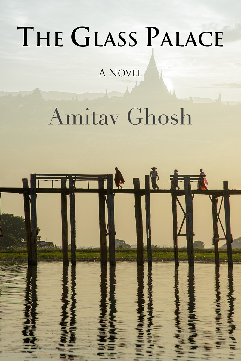
 The Glass Palace
 Add photograph to your favorites
 Add photographer to your favorites

 Photographer found comment helpful.


