|
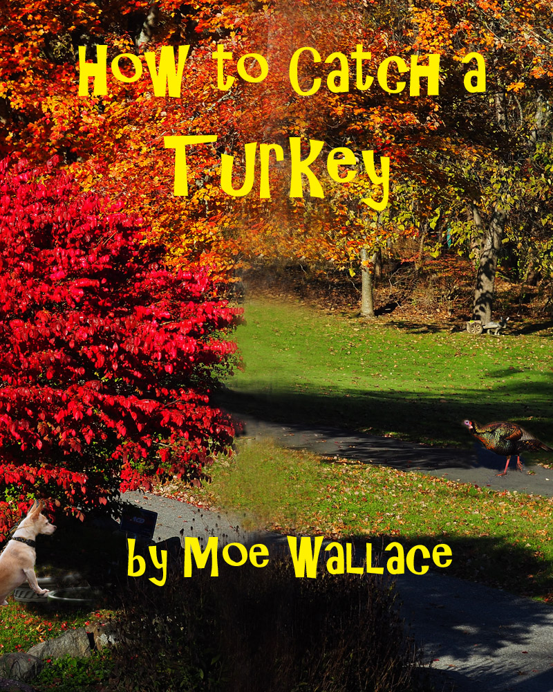
I don't like this font. Never have but it does suit this title & layout. The space between the "t" and "u" is really awkward. It could have used a bit (in this case, a lot) of kerning (adjustment of spaces between letters). The author line could be moved down and made a little smaller so it doesn't take over the image. |







 Add photograph to your favorites
 Add photographer to your favorites


 Photographer found comment helpful.