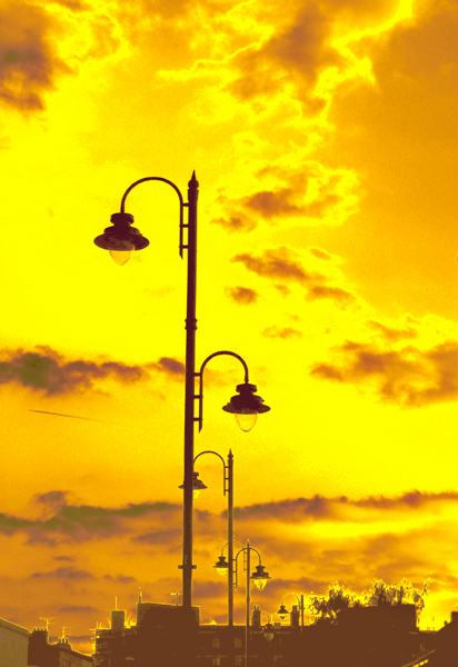
What a sky! The only picky thing that bothers me just a bit is that the main light poke is not quite vertical. Even with that - it is a very magical scene - good luck.
Very striking, but appears too much as digitalized art for my tastes. The photo has a good use of negative space, but I believe it would be enhanced by either straightening the lamp or tilting it even further to make is more obviously intentional.
Beautiful sky! I like your composition, too. Perhaps the pole could have been straightened a little and the unsharp mask used to sharpen the poles and lights.







 Add photograph to your favorites
 Add photographer to your favorites


 Photographer found comment helpful.


