What I like:
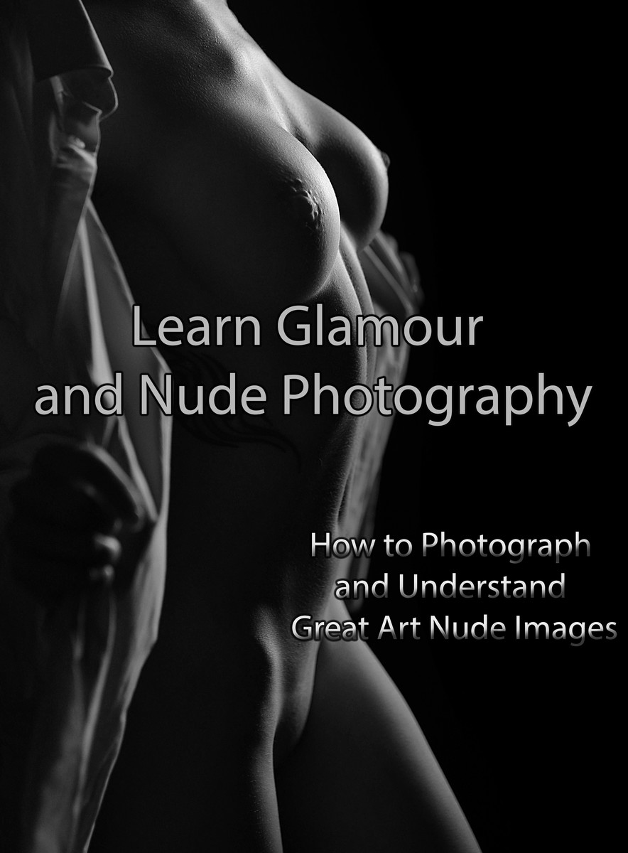
The high contrast mono palette
The lighting on your models breasts
The shape of your models breasts, accenuated by the angle you have chosen
The title of the book and choice and placement of lettering
What I am not so keen on:
The 'How to' lettering - the style seems wrong
the inclusion in the frame of the fabric (?) either side of your model - makes it look cluttered and distracts from the shape and form.
The central line that runs vertically from sternum to navel - I've never seen this as pronounced before.
The pose or the angle you have used doesn't, for me, work for the thighs and crotch area - all I can see is a chicken ready for the oven... |





 Add photograph to your favorites
 Add photographer to your favorites


 Photographer found comment helpful.


