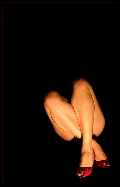
First the good. Focused, well exposed. The lighting is tastefully executed. Really highlights what you wanted to convey to the viewer. I think overall the composition is good and the perspective works well.
Now for the bad. Border does not complement the focus of this image, the legs. It rather draws attention to the shoes. Not good in this particular challenge.
And the ugly. It's a stretch to call those legs yellow. This doesn't really conjure up the image of yellow when I view it. This does not fit very well with the spirit of the challenge. You might as well have desaturated this image (or at least selectively to preserve the shoes), and toned it yellow. Of course, even then, it wouldn't really fit the theme as it would appear to have been done for the sole purpose of meeting the yellow requirement. Point is, I think this stunning image is better served in a different challenge. Sorry.
returning for comments:
Interesting. the artist uses mostly white, a touch a red and a good dab of yellow to make flesdh tones, hence the highlights. Very nice and I hope the voters will appreciate it. Cool comp. Bumping up.
After seegin 100 or so pics, this is the first that does not meet teh challenge in anyway i can see. perhaps hellow shoes, even nail polish...but unless the person is extremely jaundiced and you color corrected that away, I see no yellow or conenction to it. The title mimics the shape of the crossed legs...but that is as far as i get with it.







 Add photograph to your favorites
 Add photographer to your favorites


 Photographer found comment helpful.


