|
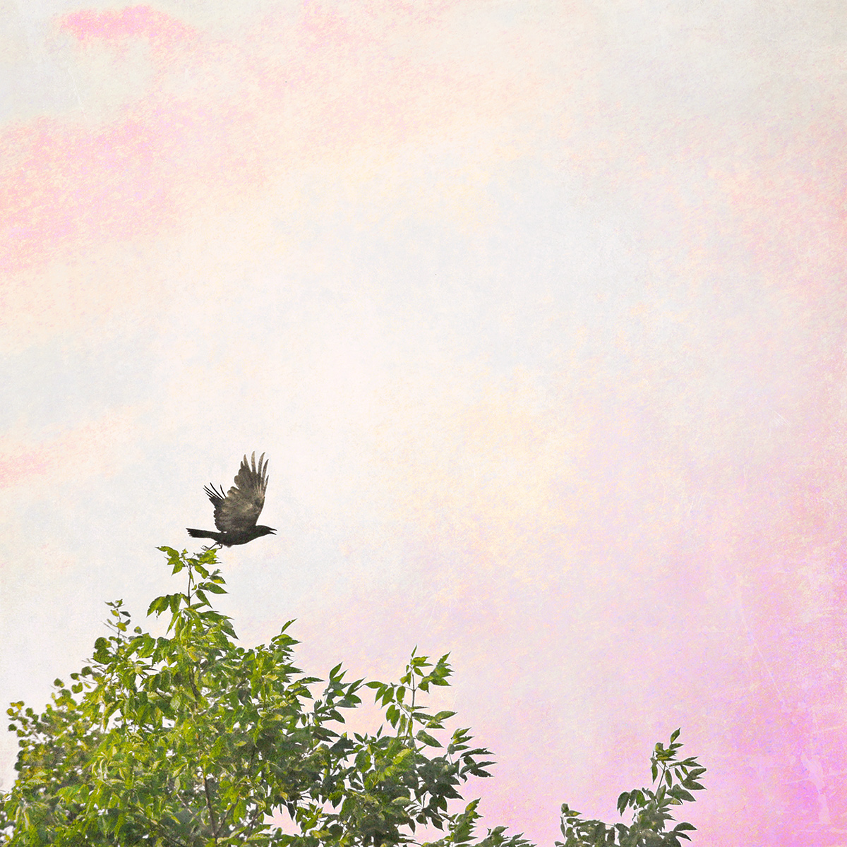
I like the idea, the treatment, the negative space, but there's still something that's getting in it's way. Perhaps it's the choice of colors for the background? I actually think it might be the white lines around the leaves making it look oversharpened? I think if it was a softer effect this would be really beautiful, but something is just jarring to me. 6 for the attempt, although I think it really is a 5 as is. I think it could have been an 8 if it came together better. |






 Add photograph to your favorites
 Add photographer to your favorites

 Photographer found comment helpful.


