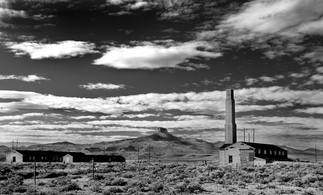
Ok, the sugar coated name for this place is the Heart Mountain Relocation Center. There are 2 landmarks involved. Heart Mt. which is the mountain in the backgraound(I know, like duh and stuff). It is a very well known landmark in this area. It is almost a god to some. It is used in the names of businesses and the silhouette is very pronounced and used all over as a design cue.
The Other landmark is what is left of the camp on a chunk of land that sits at the base of the mountain. This is one of the camps that all Asian people were taken to during World War II. What was said, was that it was to protect them from any hositle americans that were not Asian. The conditions weren't great by any means. These people were torn from their homes and lives and placed here for 'safe keeping'. The camp used to stretch for a lot larger area than shown, but this is all that is left standing after all of these years.
I find it a sad place to visit. Not only does it make you realize how we poorly we have treated fellow americans, but the ruins that are left and the desolate area that surrounds the camp set a mood of loneliness and despair.
Statistics
Place: 23 out of 143 Avg (all users): 6.2040 Avg (commenters): 6.7143 Avg (participants): 6.0000 Avg (non-participants): 6.3727 Views since voting: 1878 Views during voting: 316 Votes: 201 Comments: 15 Favorites: 0
Not sure how to word this any better, but I am finding the sky/clouds a bit too overwhelming, taking away from the importance and impact that should belong to the buildings. Good choice of location for the challenge.
I have no idea what the color version of this might have looked like, but I don't see this as a shot that needs or should be B/W The subject gets a little lost in the background without some color. Good luck.
I am so glad this is B&W - it looks like an image from Life or Look taken in the era of their documentary highlights. This grabs my heart and leaves me desolate.
Image critique: a good rich sky (perhaps a little too burned in places), there's plenty of space and the landmark is very prominent, good contrast, clear and crisp
Out-of-challenge appeal: this is pleasing, so I will probably revisit
My first impression is that this lacks something. Good sky, though you seem to have lost control of the brighness of the white in the clouds somewhat. I think my problem is with the tonality of the ground areas - all those greys merge together, there doesn't seem to be much variety of of shade there, and that prevents the buildings fro standing out, tends to merge this into a single landscape, rather than a study of the buildings and the immensity of their location. Great subject, pther than that a great treatment - I like the fact that you seem to have set yourself a real challenge with this shot, and I think you've come close to achieving it - I wonder if a different light would have helped - a lower sun, later in the day.
Nice view, especially the sky, but perhaps too many elements..it might have been stronger with the mountain and just the building with the chimney. Also the land seems to have too little contrast...too much flat grey.
The sky is very distracting from the ground. The chimeny doesn't stick out very much. and the ground seems a little distracting to especially the little plants. But overall a nice image. this is just my opinion.





 Add photograph to your favorites
 Add photographer to your favorites


 Photographer found comment helpful.


