Author Thread Comments Made During the Challenge
Post actions
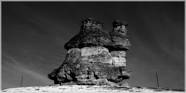
too bad the poles (?) had to be there...
Post actions
Color would have really improved this photo.
Post actions
Very intersting subject. I like the greay scale. The sky has nice texture to it.
Post actions
Great B&W, nice framing, great sky.
Post actions
Post actions
It's too hard to see your subject
Post actions
Wow, best one I've seen so far. Stark, powerful, technically excellent - 9
Post actions
I like this, but like to have more contrast between the top of the rocks and the sky. The off-center feel (though it isn't off center) is cool, too.
Post actions
I think that it's too dark on the top of the picture.
Post actions
Very nice black and white. 7
Post actions
I really like the b/w for this shot. I think it brings out the texture of the structure. I think I would have cloned out the two poles or whatever they are on each side. I would like to also see the color version of this. Still, nicely done!
Post actions
Nice textures on the rock. Photo looks a bit too dark - details are lost. Also, I think this would benefit from an off center composition.
Post actions
the gray scale in this image is great the shot and subject are great too... a diffrent angle might be nice but its great the way it is now...-GL






 Add photograph to your favorites
 Add photographer to your favorites


