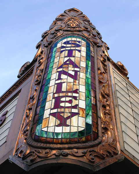
Your photograph seems to be slightly off center [bottom more to the left than the top]. I know we all talk about thirds but in this picture if feel as if 'STANLEY' would of been vertically in the middle given the picture an even flow outward would of been more apealing to the eye [imo]. However with that said I think you did a good job. I like the lighting, colors, shadows. As is [7]
I guess that depends exactly how far east you're prepared to go, really. I can see the appeal of this light and tonality, which is well captured. I don't get the use of the odd angle, which seems neither a deliberate tilt nor an advantage. I like that you've tried a detail shot, rather than a dull full-on shot of as much of the building as you could get in ... but this seems oddly isolated. I think it's a composition thing: might you still have held the sign as your primary subject, but used the lines of the rest of the frontage, or rather 'some more' of the frontage, to bring the eye more strongly to that subject?







 Add photograph to your favorites
 Add photographer to your favorites

 Photographer found comment helpful.


