This would have won the blue if it wasn't for the "softness vs. oversharpening" Not sure what it is really, but there is something that isn't right. It's still a excellent composition. Good luck, bumping up to 7 due to composition.
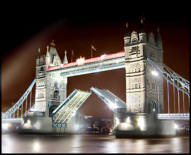
You chose a wonderful subject for your entry. I think the composition is excellent and framed very well with a pleasing perspective. A couple of comments...Slightly overexposed evidenced by loss of highlights nearby the lights. Other comment is that the depth of focus appears to be too shallow evidenced by loss of focus in the background, and particularly the far tower. Not sure what type of camera you are using, and perhaps the DOF is not easily adjustable. The exposure could have been reduced with a faster shutter, smaller aperture (increasing DOF as well), decreased exposure compensation, or decreased ISO sensitivity.
This is gorgeous, I do like the soft effect here, but can't help feel it is perhaps a little overdone... maybe a little overprocessed or exposure is too long (??) but otherwise great. 8.
I feel that you will hear a lot about the highlights and processing of this, but I have to say that it is a stunning piece visually and just gleams with brilliance.
This photo is quite an accomplishment. Everybody has seen thousands of pictures of this monument, but you have managed to make it appear unique and new. The vivid luminosity of the bridge and water, contrasted with the dark reddish tones in the sky is brilliant. Some voters may quibble with your choice of exposure, but I like the slightly blown look to some areas - it makes it glow and nearly vibrate with life and excitement. Well done photo. I predict a top 10 finish at worst.
Image critique: while this is technically imperfect (blown highlights) it has a certain a appeal becasue of them. The exposure is really too long here resulting in the pools of white, so a Neutral Density filter would help in future. I'd like to have seen more water than sky and a bit more of bridge supports too.
Out-of-challenge appeal: not enough to pull me back frequently, and the flaws do make it hard going on the eye
would have been a great photo, but it lacks sharpness. the towers seem blurred and no architectural details visible. Also the bridge cables on the far left are OOF. Needs more DOF
maybe it's me, but this feels over processed. i'm not sure what i would expect to see if i walked up on this scene at this time of day, but i'm pretty sure this is not it. when i see an image like this, i wonder what you were thinking when you saw it. did you see what you've submitted? or did you find your submission after you started post-processing? you have definitely delivered a polished, eye-catching image of a universally recognized landmark. i'm just curious as to how you feel about the work...
it does feel a little too bright at the bottom; the flares are a little too strong.
I have taken and seen many shots of this historic landmark and this has to be one of my favorites. I like the soft glow cast on the tower and river by the lights from the prolonged exposure.






 Add photograph to your favorites
 Add photographer to your favorites

 Photographer found comment helpful.


