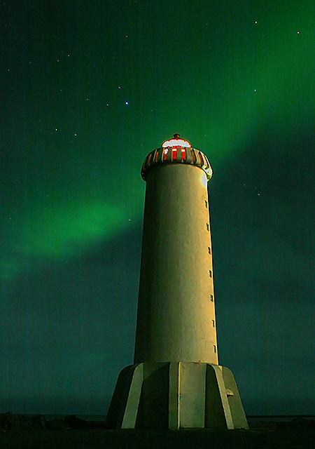
Flott mynd! Varðandi "banding" vesenið (línurnar í kornótta dótinu) þá gæti þetta verið út af villu í 20D vélinni. Það er komið nýtt firmware update á hana (sjá á www.dpreview.com). Hefðir mátt skerpa hana ögn minna, myndast smá "halo" á vitanum. Fallegur viti, og hentar vel í keppnina. Til hamingju með þetta.
This is odd...there shouldn't be this prominent banding at your settings of ISO 100 @ 30 sec. Probably introduced in the post processing (pushed the exposure?). Might have served you better to use a higher ISO. Not sure.
A beautiful photo, clever title. With a little less processing (the background and awkward red halo on the light are annoying), this might be a ribbon.
Great Northen lights and excellent lighting on the lighthouse. The red at the top of the building is a bit bothersome - but that's a minor distraction when compared to this wonderful image in its entirety.
Image critique: flawed beauty. It has charm, great lighting and of course a wonderful peripheral interest in the Borealis. You'ved positioned the subject very well and you've got a good POV to create a dramtic composition. The sriations are an irritation and you've pushed the saturation to hard, making the red in the light very harsh. An unnecessary tweak in my view.
Out-of-challenge appeal: I do like this despite some flaws, so I'd probably come back to gaze at the eerie beauty it transmits.
There's something really peculiar about this shot - there seem to be striations running vertically through the image, which I can't understand. There's also a sense of blockiness to it, throughout tthe lighthouse textures. Great image though - and controlling the burn-out from the light must have been a hell of a task, and there's only minor distortion around it. Not convinced by your composition quite - the light seems placed neither centrally nor privileged, and I think that adds an unease to what ought to be a simple and elegant shot.
There's a horizontal (to the sensor's orientation) banding pattern here reminescent of Canon 20D's. I won't hold it against this photo. Wonderful exposure, colors, and the stars are so sharp and prominent.
annoying green cast to everything. I was thinking about doing something of the same kind, but couldn't find any NL (almost got some with Hallgrímskirkja church and the moon - a garanteed ribbon)
I've seen this lighthouse before, near Akranes? It's like a cross between a rocket and penis. /7 (-2 for green cast)
Excellent suject! I would have gone for either a perfectly centered or more off-center composition, but that's minor. The vertical stripes however are a killer, especially at the Mac native gamma of 1.8. This is also one of those images that just looks totally different at the 2.2 gamma point (looks better that way to my taste), so don't be surprised if you get two very different sets of comments. 6
This one reminds me of Tin Tins rocket :-) The colors are very cool and I like the lighting on the lighthouse. I find the composition somewhat distracting, seems to lack balance, maybe a different viewpoint would have helped. There is very much noise which you surely could have gotten out of the way.
Beautiful shot! There is however some vertical banding patterns that are probably due to the long exposure. Higher ISO might help to reduce the exposure time and hence possibly eliminate the banding.





 Add photograph to your favorites
 Add photographer to your favorites

 Photographer found comment helpful.


