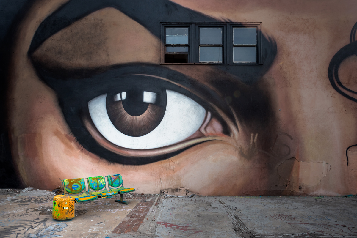
I entered this knowing it would be a risk. To me, the blue/orange/green seating is the "complementary" color to the browns and whites of the wall.
Yes, it is a minor element in the image.
Yes, the eye is certainly the focal point.
And yet the placement of the seats seem to be a teardrop, and I thought that was strong enough to balance the image.
No hard feelings for anyone who didn't see it that way :)
Statistics
Place: 5 out of 30 Avg (all users): 6.0513 Avg (participants): 4.5714 Avg (non-participants): 6.8800 Views since voting: 837 Views during voting: 79 Votes: 39 Comments: 17 Favorites: 0
Wow, I really like this.
Congrats
Where was this taken?
I agree with the post below, Outstanding!
However, I like the subtle way the complementary colors are in the image.
Thank you! This was taken in a graffiti park in downtown L.A.
Wow, I really like this.
Congrats
Where was this taken?
I agree with the post below, Outstanding!
However, I like the subtle way the complementary colors are in the image.
This is an outstanding shot and probably would have ribboned in another related challenge. I would be willing to bet that those lower scores (not me) were given by people who felt that your complementary colors were not dominant enough in the picture.
absolutely love that this did well ..
even with all those low votes ..
congrats on top five ..
a credit to a wonderful photographer ..
a great eye ..
and something that does fit the challenge .. altho not at first glance ..
which is wonderful .. ppl have to actually look .. :)
this is such a brilliant shot .. so well seen ...
not sure how it will go in the challenge .. i struggled to find the complementary colours as a subject .. took me a while .. blue and orange i'm thinking ..
i really like how this is not your standard take on a challenge like this .. and i hope you do well ..
we need to step out of the box sometimes .. altho leaving one toe in can keep us 'acceptable' .. lol ..
i'm not voting yet .. :)






 Add photograph to your favorites
 Add photographer to your favorites

 Photographer found comment helpful.


