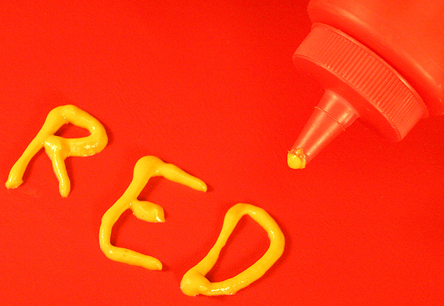
Actually I think this is technically done well. The highlights are just a tad blown out, but just a tad. The red is fine and the contrast settings are good because you can see definition between the red background and the red bottle. I think it is a funny take on the challenge. I would have given it a 6 or 7.
A lot of the voters at DPC anymore seem to have tunnel vision when it comes to voting and have no sense of humor. Maybe if your photo would have had a yellow background, yellow bottle, with yellow letters spelling "yellow", people would have understood how it met the challenge and scored it a bit higher. Maybe... :-)
Message edited by author 2004-12-15 08:31:37. |






 Add photograph to your favorites
 Add photographer to your favorites

 Photographer found comment helpful.


