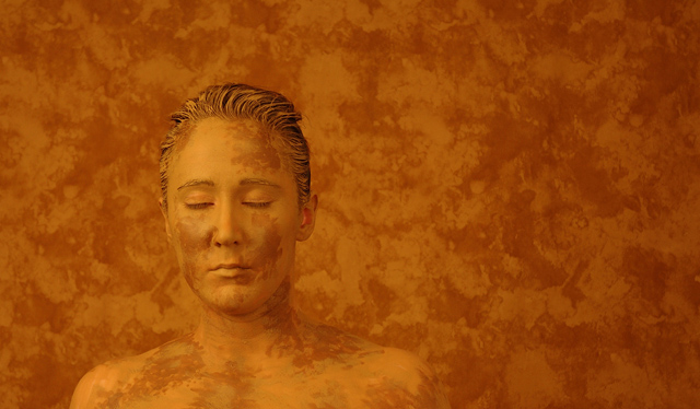
This is the first challenge photo I've taken with my new Nikon D70 and I am absolutely in love. None of my friends wanted to volunteer to be covered in yellow ochre paint (go figure!), so I posed myself.
For those interested in the setup information:
Mixed "yellow ochre" and "amaretto" acrylic stencil paint to match my backdrop as much as possible. Preset focus, lighting, and distance from backdrop. Spent about 30 minutes painting myself from the chest up and one arm with yellow ochre then added in the amaretto detail paint. Took about 4 shots to refine the aperature and shutter speed, 6 shots with my arm up, 2 shots with my arms down. Turns out that the paint had started to crack under my arm, so I tossed out the arm up shots. After doing a quick check of the images on my computer, I hit the shower and needed to use a scrub brush to get the paint out of my hair. I think I also clogged the drain. Oops!
This was shot in RAW mode with available studio light. Post processing includes:
cropping and +10 bump ups on brightness/contrast.
Regardless of the score I may receive, I'm very happy with this photo.
Statistics
Place: 40 out of 393 Avg (all users): 5.9239 Avg (commenters): 8.2667 Avg (participants): 5.8795 Avg (non-participants): 5.9837 Views since voting: 1298 Views during voting: 506 Votes: 289 Comments: 40 Favorites: 10 (view)
I tried commenting on this one - but I added it to my favourites before submitting the comment :P. Basically what I said was this is a stunning image, you look positively serene - Glad you kept your eyes shut. One of the better self portraits I've come across. Such a shame this wasn't a true yellow - if this was an orange challenge you would have been shoe in for a ribbon. Still, it's verging on a travesty that this didn't break six.
Thanks to everyone for your comments. So, why was it so orange you ask? It didn't even dawn on me until the voting was half over. My computer crashed a week before this challenge and I rebuilt it just in time to post-process my photo. What I did not do, however, was reset the gamma and the other calibration necessities on my monitor. This makes twice that calibration has caused an issue in my entries. I'm a B&W girl, so it's usually not such an issue, but I paid the price here. Once I got everything reset, I found that I needed to shift the hue about five points toward yellow to make a realistic representation of the color I used. I plan on posting a color corrected version to my portfolio later this week for those who are interested. Thanks again everyone. Heather
Wow - it's so cool that you went all out and did one of these shots for this challenge. (Or maybe it wasn't just for the challenge. ;-) I really like this kind of shot and yours came out really great. Very nice job!
Great photo! I admire the lengths people here go to get a great photo just for a weekly website challenge. I can say this about a lot of photos on this site, but now, after seeing this photo, is when I thought to say it. It shows how seriously you, and all the others take their craft. Perfect expressionless face. And sometimes I tell people that they don't need to use the challenge name in their title, but here I think it works. Can't stop looking at it (the picture, not the title).
I really like this picture. It is very creative. I don't see that it is a picture related to yellow... at least on my monitor it is browns and peaches.
Very creative, visually interesting capture. I think a color shift more toward yellow (away from orange/red) would have put thus over the top. Definitely the most artistic shot that I have seen in this challenge. Excellent work! 10 (initially 9, but after voting on everything else, this the best and my only 10)
Excellent photo! The colors are rich and really compliment each other. The make up is superb, closed eyes make it look even better without making a distraction! Hope to see it as a winner! Good luck!
Composition: 7, I don't really like the rectangular composition here.
Technical: 10, I can't find anything wrong with this technically.. It's sharp, clean, and wonderfully lit.
Appeal: 8, Definitely very artsy, with a nice appeal.
Challenge: 4, I had to dock you on this, as this really is more orangey-red, with the only yellow feel being highlights on the face, and slight ones at that.
Overall Calculated Average Score: 7, Were it more "Yellow", a much higher score.
returning for comments:
A very impressive artistic rendition. Would have loved a brighter accent of pure yellow, but an interesting image all the same. Bumpimg up.
It looks more like shades of orange and not yellow,
but despite that: what an awesome shot!
I also think that the person having the eyes closed makes the composition relaxed, the colors and the warmth of the light enhances that. The random structure of the blobs makes it all look very natural, classic and human as opposed to hard, tech and modern.
Weird but pretty good; you almost got her to blend into the wall in the background. However, this doesn't say "yellow" to me...... red/orange/rust, but not yellow.
This person is a good sport for sure!! The photo is a little "artsy" for my taste (which isn't a bad thing). I tend to see more orange than yellow (but I am shade blind!!). Very creative take on the challenge - top notch potography! 9
Stunning. A truly remarkable entry. I think this is one of the few photographs that really illustrate the spirit of this challenge. Most have just simply photographed something yellow. Well done!
neat! i always wanted to do a shot like this, like in some crazy plaid or something. technically i think your color is sliding down the yellow spectrum into say, burnt siennaville, but its such a cool idea, i dont even care. :)




 Add photograph to your favorites
 Add photographer to your favorites

 Photographer found comment helpful.


