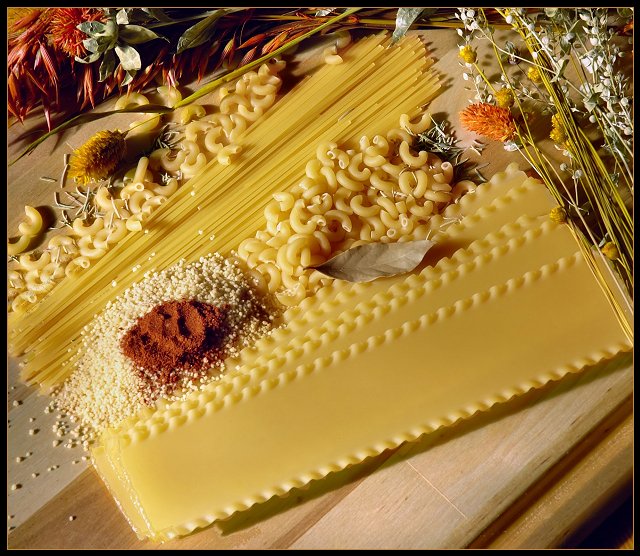
Adjustments were made to hue/saturation, white balance, curves, color balance, and contrast. Neat Image was applied, then the photo was cropped, reduced in size, unsharp mask applied and a border added. Photographed in natural light coming through the dining room window, with the D70 kit lens.
Statistics
Place: 47 out of 393 Avg (all users): 5.8023 Avg (commenters): 7.4000 Avg (participants): 5.6735 Avg (non-participants): 5.9655 Views since voting: 1253 Views during voting: 342 Votes: 263 Comments: 21 Favorites: 0
I can see this hanging on a kitchen wall. Great setup and something different in this challenge. Another nice finish. I did a kichen scene also but mine didn't do well at all. :)
I love these sorts of shots, this is very nice, even though this is something I would definately hang in my kitchen, I'm not feeling yellow in this photo, even though I still give it an 8, very nice.
This is lovely! The focus is tremendous and the colors are so rich. I personally would have preferred a closer crop on the bottom, but that's just a personal opinion. BOL :)
This still-life shows such perfect preparation, but it requires some time to appreciate. I confess that I almost passed over it in my "large challenge haze." I'm sure glad I stopped to look. Amazingly beautiful composition. My hat is off to you for creating and sharing this. It's one of my top picks for the challenge but I fear your wonderful entry will be lost in a stack of glitzy sharp peppers or flowers.
yum yum... I would have cropped it a little from blow.. not to see anymore the margin of the table (wood).. and have changed a little the point of view.. otherwise fine... 8
Looks like a great shot for a manu or something in a restaurant. The lighting seems good and gives the image a unique feel. While it's not quite yellow, I suppose it is well enough to meet the challenge in my eyes.
There doesn't seem to be a unique or center subject for my eyes to come to rest at and seem to continually jump around the image. Good work.
Nice composition. I wonder how it would have looked if you could have cropped out the lower right side of the picture. For me the end of the table sort of distracts me from the beautiful arrangement you have set up. Maybe zooming in a little and cutting off some of the pasta to the lower left portion of the picture would draw the viewer more into the picture.
Very nice - this looks like it could be in a cookbook.
Lighting is just a bit harsh on the bottom left area - edge of the bottom pasta and the grain is sort of blown out. Nicely arranged - 8.
This shot is beautiful. You certainly are a genius with color. Great use of contrasting shapes and textures. Pleasant image. Powerful initial impact. This is a case where the whole is greater than the sum of its parts. If I dissect this image, it loses its power. Great artistic eye.





 Add photograph to your favorites
 Add photographer to your favorites

 Photographer found comment helpful.


