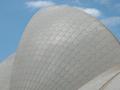
I had different angles of the building but really liked this one in particular because of the trees.
The colored wasnt working because there were bright yellow highlights on the building and i didnt use a polarizer for the sky so it was a weak blue.
I desaturated and then duotoned in PS
Statistics
Place: 51 out of 143 Avg (all users): 5.8689 Avg (commenters): 6.2308 Avg (participants): 5.6837 Avg (non-participants): 6.0370 Views since voting: 824 Views during voting: 283 Votes: 206 Comments: 14 Favorites: 1 (view)
Man I was 100% sure most people would dislike the branches and find them cluttering/distracting, thats why I told you I love them ;) I think they add a really nice touch to the photo and makes it more interesting to look at. It should have done way better IMO!
I knock down other photos with trees in the front of the photo but for yours it seems like it works for some reason. Maybe because the top is exposed or because it seems clearer. Good job.
Classical, neatly organised - filling the negative space with trees is always effective, and makes a useful lead into the top of the dome. Clever composition, and strong sense of plasticity in the dome itself.
I really like the idea here. I like having the trees there, but they really almost seem to overwhelm the focus on the building imo. Still, one of the better shots I"ve seen.
The branches are very distracting. the light on the left side of the building is very bright, thats my opinion. If this didn't have the branches it would be a very nice photo, but that doesn't mean it's not good i like it. this is my opinion.






 Add photograph to your favorites
 Add photographer to your favorites

 Photographer found comment helpful.


