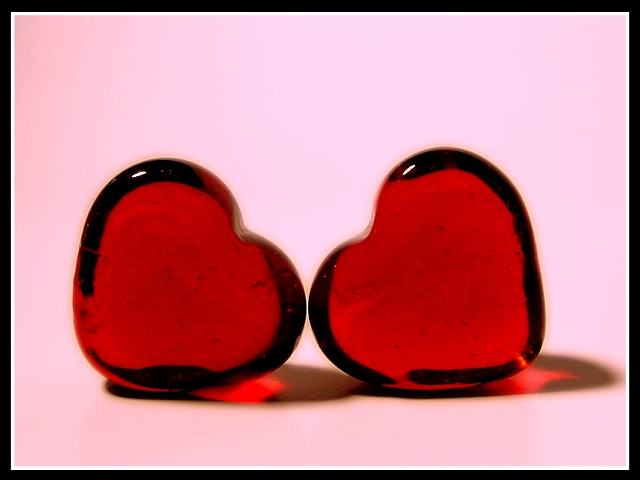
Used macro settings. Light on top and to the side. I think I will get a score of 5.20 or lower, because I think it is to plain, not interesting. I like it because of the shadow and the simplicity of it.
Statistics
Place: 12 out of 48 Avg (all users): 5.8901 Avg (commenters): 7.2857 Avg (participants): 5.8500 Avg (non-participants): 5.9216 Views since voting: 1572 Votes: 91 Comments: 10 Favorites: 1 (view)
Challenge met. Two cute hearts, I like how they are leaning towards each other. The strong lighting, creating those red shadows works very well here, especially since you didn't get glaring hotspots on the hearts, just nice little highlights (I bet that was tough!). I don't usually like pink and red, but they go together well here. A black border works well, too, I would probably remove the white altogether (nothing in your photo is white, so that part doesn't tie in well) or replace it with a thin red border to match the hearts. Nice photo. :)







 Add photograph to your favorites
 Add photographer to your favorites


 Photographer found comment helpful.


