Author Thread Comments Made During the Challenge
Post actions
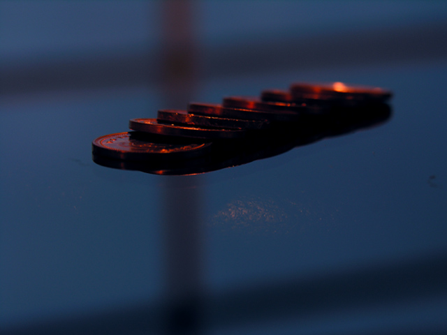
This is a bit dark on my monitor (which could just be my monitor)
Post actions
The best coin shot I have seen so far. The colors are nice and the composition is decent. I would have tried a slightly higher viewpoint. -6
Post actions
I wonder how you got the effect that it looks like flying. Colors are pretty interesting too but would like bit different angle to see more of coins.
Post actions
the brown smudge is destracting
Post actions
I think the coins are too dark, but I like the contrast of the colors and the surface they're on.
Post actions
Would have like to have seen this on a very light reflective surface to show pennys in reflection..kind of on the dark side.
Post actions
Post actions
Nice idea, but just doesn't work for me. The window frame shadow on the whole photo is distracting and takes away from the subject. Also I see a discolorization in the middle below the pennies and I'm not sure what it is.
Post actions
I really like this photo. I think it maybe a little to dark.
Post actions
Post actions
too dark and not enough detail. the criss-crossing lines are distracting
Post actions
interesting... but won't score well because it's too dark.
Post actions
interesting effect, but wish the surface could be fixed with cloning/healing here.
Post actions
I like everything about this photo -- metallic on metallic, colors are great, and the gridded background shadows add complexity and aren't overly symmetrical. Nice job!
Post actions
Good subject, reasonable comp. I think the colors would be good but they need brightening up IMO.
Post actions
They seem to be floating...neat!







 Add photograph to your favorites
 Add photographer to your favorites


