I used a single light source which is a big white light bowl twice the size of a basketball. The light was placed at the side and in the same height of the fruit bowl.
At the top of the image is 25 cm high orange paper which reflects light on the forks. The base is a cyan cardboard size A2. Above the camera I held a red cardboard and moved it a bit so my hands would not be reflected.
The color, the leading lines, the composition; all work together to provide a fascinating feast for the eye. This was a great idea, well executed. My technical side would have liked to have seen sharper focus, especially on the individual tines of the forks, but the overall effect is not diminished. Great job!
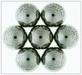
It gives a very nice pattern, combining circular shape of the spiral object and the straight lines of the forks. The use of lighting and reflection to give the red and orange colors on the metals give a good contrast to the silver of the metals.
Nice title. I have to admit it perfectly describes the picture. The nice, bright colours, clear reflections and counter-reflections make this shot sth special. The crop is great, it emphasizes the impact of the circular movement and the movement to the center indicated by the forks. 10.
Me thinks this is gonna place 1st. Colors are exceptional and I think that it is well-balanced. The only negative comment I can muster is that the reflections of the forks make it more than 7...but heck, who's countin'...;) GL. 10 from me.
wow what a fantastic composition. I love how both the spirals and the fork prongs guide your focus without confusion. I joined this website today and this photo inspired me to make my first vote. Great work.
This is definately cool and interesting. Actually I love it. I love the color, your focus and clarity are really good and the angle and framing/cropping are also great. I wonder though if people will count the reflections as part of your 7? I know what you mean though. lol ~Heather~
A very uncommon take on a very common item. The complexity created by the reflections and arrangement is very interesting. There is a slight discoloration in the lower right corner (no biggie, just noticed it.) The only other thing that I see that keeps this from being a 10 in my books is the lettering on the backs of the forks, but not much you could do about that. 9.
=) Awesome. Somehow this looks strangely familiar... not implying anything, i've just been playing with slinkies lately, so i got them on my brain. =) The only thing i'll mention is that cyan on the right would look slightly better if it was a darker shade of blue. Would go with red in a little more appealing way.






 stainless
 Add photograph to your favorites
 Add photographer to your favorites

 Photographer found comment helpful.


