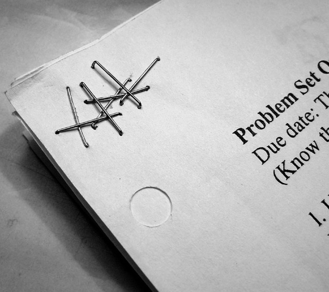
The composition could probably be a bit better for my taste, personally. For example, my mind just seems to see things better in the 3:2 format or whatever...or as long as it's a bit wider than it is tall, it seems to help me out. Take your browser and make the top shorter, bring it down so just about 1/3 of the paper hole is showing...and it just looks much stronger to me and holds my attention and focus better.
Anyway, what I like the best is the tones...You really got a nice conversion to black and white here and in order to do that, you gotta nail the exposure, which you seem to have done perfectly.
I think what makes a nice black and white photo is the right amount of darks and lights, which in your staples, especially, they look just right.
So anyway, nice photo, nicely executed, good composition, and perfect exposure. Keep shooting bro.
This is a really terrific idea, I like the shadows and tones, maybe it would lose a bit of the context but I'd like to see this cropped closer around the staples... either way, well done. 8.
Very clever and the composition is great! The only thing that I would like to see different, is the hole on the page... I think it would have added more depth. Good job! Another exemple that a good picture does'nt have to be complicated. The complexity should reside in the photographer's approach, not the subject. Most time anyways... Nice, very nice.






 Add photograph to your favorites
 Add photographer to your favorites

 Photographer found comment helpful.


