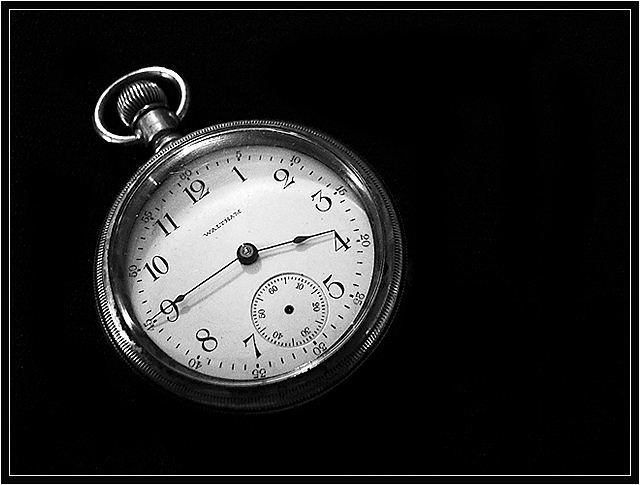
Okay, so I really had no idea how to interpret this challenge. The notion of "low tech" is a very broad one, and it's very subjective (depending on a person's individual technical background), just like "high tech" would be. I'm not really sure what is considered non-electronic, either, so I ended up scrapping my original idea and just going with this generic old wind-up watch. This is far from being my favourite shot, and it's going to do very badly, but the definition is too vague to really have fun with this challenge.
Editing: Resized, converted to black and white, curves, levels, cropped(?.. I think), sharpened, light spot editing to remove some fabric texture, and border added.
Statistics
Place: 68 out of 177 Avg (all users): 5.5212 Avg (commenters): 7.1667 Avg (participants): 5.2784 Avg (non-participants): 5.8676 Views since voting: 784 Views during voting: 214 Votes: 165 Comments: 6 Favorites: 0
Hmm...first vote and comment did not stay, so here goes again...
Nice border and use of negative space. Watch is an easy link to low tech for me. Highlights on the fob ring and shadows on the bottom of the watch were eyecatching to me. I liked the way the light caught the crystal, reflecting the scratch and giving the glass presence. Missing second hand is distracting, but not something that affects the score. Overall a high marking image.
If you were to open this little fellow and study its guts you will be flabergasted at the high tech engineering that inherent in the pocket watch. Low tech it is not, but your image is attractive with good detail. Bumping to 7 on good presentation.
cool watch. pretty well done. i think i might like it better with a centered composition, in this case. maybe if the blank space on the right was cropped to match the left? but that's just my opinion. i'm sure you like it better like this.







 Add photograph to your favorites
 Add photographer to your favorites


 Photographer found comment helpful.


