HELLO!
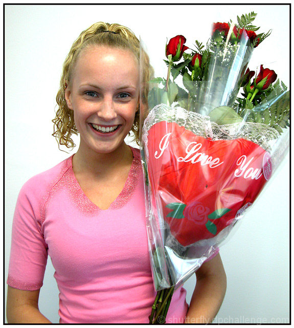
This is such a happy picture. The comments are kind of funny though. People are always complaining about backgrounds being distracting, and now they're complaining about it being too plain. I do think that a solid in a different color would work better though. The lighting is a bit harsh, and the white bg only makes it more so.
I also have to agree about the cellophane wrap. It's really reflective and somehow cheapens the bouquet.
Technically: Focus is good. Cropping is good. Lighting could be more even and diffused. Colors are nice. This reminds me of 99% of the christmas morning shots where the kids are holding up their presents to show off. Because of that, it doesn't bother me that she is looking at the camera.
It's a good shot for the challenge. The lighting, plastic wrap, and bg are the only improvements I can think of. Maybe she could hold the flowers a little lower in the frame or wear something a little dressier. Honestly, I think this is a tough age b/c they're really too old for the "cute kid" factor and too young for the "glamour" or fashion shots. For the most part, people just don't have a lot of interest in looking at pictures of other people unless they fit into those categories. Outside of the proud parent album, this sort of shot would probably work best in a flower ad campaign. It still got a very decent score, and IS a nice photo.
The girl's smile is absolutely fantastic. I love it. The lighting seems a little bit too harsh. The spot on the forehead looks a little ugly and the eyes and mouth are in shadow. However, I like the overall image.
Good shot. The white in the background is so stark, it looks a bit over exposed, but it definitely brings the subject out well. I like how I can see the blue of her eyes, and the sparkle in them. The roses are lovely too. 'well done.' -annida
I think this photo looks more like a mug shot,... why you ask? the background...
most good potratures have a non-static background, ie a park... something that will give the photo depth without adding complexity to the shot... take for instance the bride and groom shot for this challenge... put them infront of this wall... same pose, same angle... lets just say it wouldn't have turned out as good as it does with the dead winter "foliage"







 Add photograph to your favorites
 Add photographer to your favorites

 Photographer found comment helpful.


