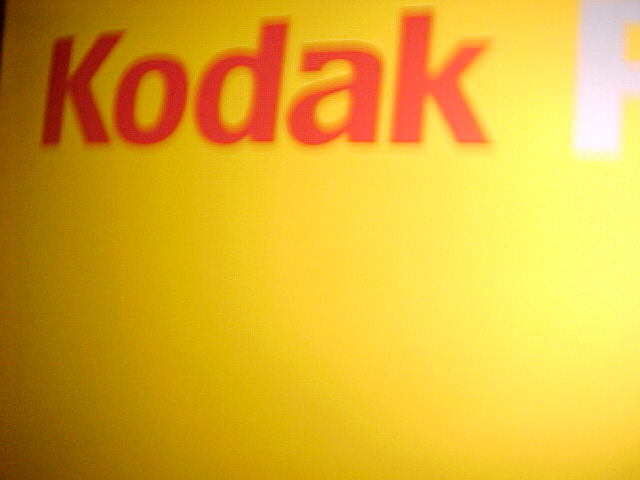
Normally I wouldn't like "fuzzy" images, but here it works. I think you could have improved it by cropping off the dark in the top left corner, and I'm not sure that the white letter in the top right is helping either.
You have lots of yellow, challenge met. Focus seems WAY off, to the extent that I want to ask, was this on purpose? I am open to PM's, so feel free to explain if you would like to, even during the challenge week. I'm having a hard time offering positive comments, bear with me. Even the exposure seems less than even handed, did you use a flash? (centered on the right side of your camera?) The best I can go is a 4, sorry. Swash
You met the challenge with the color here although the Kodak part is out of focus. DId you do this on purpose for the effect? I would have cropped out the letter "P" in the upper righthand corner and not have put the word "Kodak" so far into the top left hand corner.
Why the blurred text? Is this deliberate or a defect/limitation of the camera. The composition is ok, however there is a little bit of black on the leftmost top edge which I would have cropped out.
Wish I could rate it higher. I LOVE the concept, the yellow is fine, but it disturbs me to see the Great Yellow Father's logo out of focus. If it was intentional, I do apologise.





 Add photograph to your favorites
 Add photographer to your favorites


