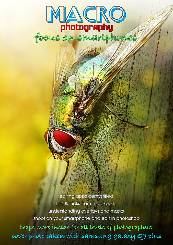
when i heard this fly buzzing and land near me.. all i had was my camera with the 24-105mm lens on it .. and my phone ...
can't really get a good macro with the 24-105 ..
hurried to get a couple shots with my phone as i could hear toddy getting nearer and he would definitely scare the fly away .. and he did ... ;)
never thought for a moment that the photos i was able to take would be good for anything ..
then i saw them on the computer ..
phones can take good photos .. !! ..
[Mar. 23rd, 2020 02:08:00 AM]
edit to say .. thought i'd step out of the usual format for a magazine and do my own thing .. and make the fly grab the attention .. :)
Statistics
Place: 13 out of 28 Avg (all users): 6.6038 Avg (participants): 6.6316 Avg (non-participants): 6.5882 Views since voting: 884 Views during voting: 114 Votes: 53 Comments: 9 Favorites: 0
After reading the comments on your (and my own) entry I get to the conclusion that it's not the different fonts but the "accepted" magazine layout -as you mentioned.
I also was looking at actally existing magazine covers - as examples how to do it - they all use different fonts and many other fripperies...
But 6.6 is a great score.
BTW: Thanks a lot Roz for your lovely comment on my cuisine magazine - it made my day!!!
Oh and I just read some of your comments about the fonts, I looked at different types of magazines and many of them use three or four or five different fonts...so there... I actually liked all the fonts that you used.
thanks Anita .. I removed what I'd written wondering about the comments about using different fonts and colours.. thinking not many ppl would see it ..
my thinking was that most magazines use different fonts and colours .. maybe because I didn't use the 'accepted' magazine layout it was more noticeable??
Oh and I just read some of your comments about the fonts, I looked at different types of magazines and many of them use three or four or five different fonts...so there... I actually liked all the fonts that you used.
Not only a fantastic macro photograph but a wonderful presentation. Only one slight criticism is that you might have gone a little overboard with all the different fonts and colors. It doesn’t take away from the enjoyment though.
Voters will comment that you used to many different fonts. I won't be one of them, but I will hint at it. Aside from that, I'm blown away that you did this with the same phone I carry. Now it's going to bug me, that I don't use it more often. :)









 Add photograph to your favorites
 Add photographer to your favorites

 Photographer found comment helpful.


