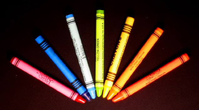
The lighting seems a little harsh. Perhaps putting the light source further away for more difuse light, or using some type of difuser -- a sheet of tissue paper works -- would help soften the highlights.
You say VIBGYOR The colors of the rainbow, then don't actually put the colors in the photo. you have 2 oranges, and 2 blues, but no indigo or violet, and the green isn't really green. Setting that aside, lol, you do have 7 of the subject in your photo. however, focus is soft and lighting is aweful. See how bright some of the areas are on the crayons? makes it really hard to look at. ~Heather~
Good technical study. Shows mastery of camera and editing. Good contrast with background. Would do well as stock photo, I think. Saturation feels a bit over the top but since most stock is cartoon, over the top often works.





 Add photograph to your favorites
 Add photographer to your favorites


 Photographer found comment helpful.


