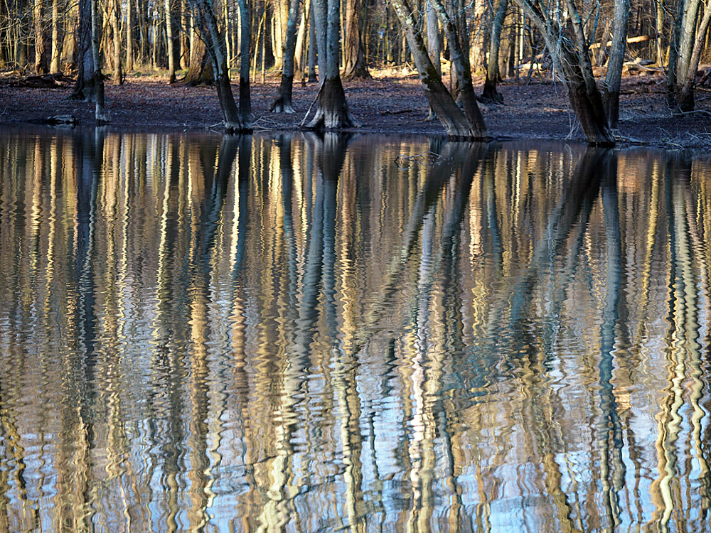
Nice capture of the reflection and ripples. I think I would like to see more of the tree tops and straighten the shoreline a bit, all in all nicely done.
I like it a lot. Love how the reflection slowly disappears in the movement of the water. Well seen.
I am not sure whether I would like it even better, whether the bank was perfectly balanced or whether the trees would affect my sense of balance. It's probably a matter of personal taste
from the other photos i've seen this looks like a ribbon winner to me .. most likely blue .. but just so you know .. i'm not a good judge of what is going to do well .. ;)
i'm LOVING the reflections .. you've totally nailed this ..
i'm a sucker for reflections .. :)
ps.. just came back to have another look .. it's not just the reflections that grab me it's the gorgeous lighting too ..
Overall a very interesting image for the eye to travel through. The array of colors and textures are pleasing and not over processed. I think a slight vignette would be an asset here and maybe a lighter upper center to take the eye to the center of the image.
Coming back to add more: I think a crop off the bottom would be a good thing. I say that since I think you intended the tree trunks to be the main subjects. The eye goes to lighter areas of the image first, then it travels around to find other things. The bottom part of the image is the lightest and has basically nothing there to look at. The more interesting part is in the water from the middle of the image and going to where the tree trunks start. A 16:9 crop would be good here, or even a square crop would work too.
Personally, I think this is pretty good, myself, I would have cropped it where that sunshine level starts, so just a short amount of the trunks can be seen and the rest water shadows. Maybe just a little contrast and a tiny bit more of saturation on the water, but other than that cropping this reminds me so much of ursula For a Free Study, I would have given this a 5/6 for now, it is an 8
It's wonderful how the upper realism morphs into abstraction in its reflection. Many reflections have this quality, but this transformation is just right -- departing from faithfulness to the original yet not muddied beyond recognition. The colors are muted and lovely. Because of the proportion of upper to lower the subtle blues of the sky are gently introduced. This lower half of the image alone would do beautifully as a fabric.
Personal favorite of the challenge.
This would get a 5 from me because it forces me to ask the question "What are they trying to show me and why do they want me to see it?"
There are certainly some interesting elements here, particularly in the way the ripples interact with the reflection, and I get that this is what you're trying to capture. But there's no "And then what?" Others may have said this but this would work much better rotated 180 degrees, giving the "trees" an abstract, painterly quality. As is the lines of the trees lead your eye up to the dark and incomplete shoreline where I have to wonder if I'm missing something in the woods?
Otherwise be careful with the interplay of dark and light areas. The shoreline is too dark and high contrast. Let me see some of the details in the darker areas as textures add interest.
There was definitely something here you could have done something with. It just falls flat for me as is.
Not a bad image. I like the rippled reflection in the water. The light on the trees is a little distracting. I wonder if it would look better to have cropped that portion out.
I think if you cropped the top bit out of the shot and left just the reflection, then turned the image upside down you would have a great chance of the blue ribbon, the gold & blue tones rippling together makes a much better image than a bunch of tree bottoms with no focal point.
Wonderful reflection. Just the reflection on it's own would have made a stronger impact on me, however. The small bit of shore at the top draws my eyes upward to the least interesting part of the image.
This is a lovely photo as it is but when I scroll down to the top of the reflection, it is stunning and would have been my pick for blue if cropped to eliminate the shore. That is just my preference of course. Top two as it is.
The composition looks fine. The reflection is making it interesting, but that's about it. If it's an attempt to make it artsy, there is a lack of order (straight lines vertically and horizontally). I also believe that this would look better in black and white and a more dramatic processing. In this challenge it is in my top 3.
I will give you 2 extra points (6+2)for the purpose of this challenge and my Red Dragon Award
Those reflections are really nice especially with the ripple effect. I find the top section of the photo pulls this image down but I am not sure if cropping the photo to just the reflection would have worked.
It's good how you captured the consistency of the ripples in the water. This image might have been just as interesting with only the water surface shown and rotated around.





 Swamp Land
 Add photograph to your favorites
 Add photographer to your favorites

 Photographer found comment helpful.