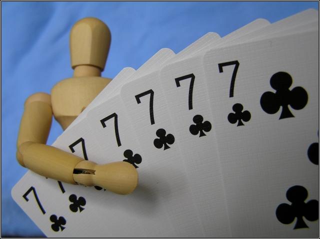
I am not one of the woody-haters. In fact, my humor entry used one. However, I think the lighting in the photo leaves this woody a little flat. Great focus and dof. Good natural colors. The wrinkled area above Woody's head to the left is a little distracting. These are the kinds of comments I wish someone would leave for me, so I hope you find them helpful :)
Interesting idea, though I think I would like it more if the depth of field extended to include the body and head of woody. Good texture on the cards though.
Very nice shot. Not quite sure the purpose of the little man, but he does help to add something interesting to the shot as well...it's now not JUST a photo of some cards. The background is very nice, I like the blue. Focus and clarity are really great on the cards, and DOF is good as well. I think that I do like this shot, my only tiny nitpic is the black line across the bottom of the photo in the lower left hand corner. Kind of a distraction in an otherwise bright and fun photo. Good luck in the challenge. ~Heather~
Another one of those creepy little wooden guys. I have been seeing alot of them lately. Nicely done. A little fuzzy focus on the head of the guy though. You get an 'A' for effort (going through 7 decks of cards)
Woody wins the Celebrety Poker Showdown! The cards are nicely focused. The photo would be better without the folds (or shadows) in the background, IMO.





 Add photograph to your favorites
 Add photographer to your favorites


 Photographer found comment helpful.