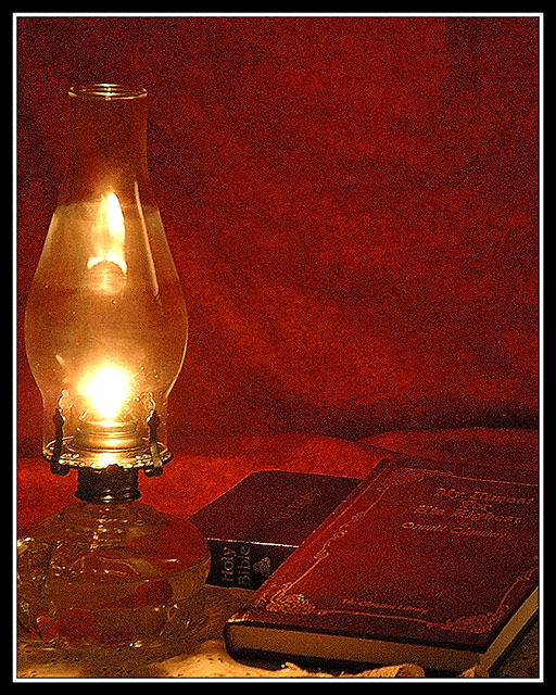
He placed the matches far away from the lantern. It was unexplainable, the quality of the heat the flame always cast, but it made him wary of placing them too close. It wasn't exactly that he feared the lamp. Instead, each time the oily wick burned, the presence would again make itself known. Sometimes, when gazing through the flume, he imagined that the Angel of the Lord Himself, had taken up guard with sword drawn, to watch over the nightly prayer study.
------------
Lately I have been shooting RAW, previewing in Nikon Editor and then working from RAW in Photoshop to finalize the work. Tonite, the Nikon Editor preview's grain was too powerful to overlook and I knew it had to remain part of this shot.
RAW to Nikon Editor -> Convert to TIF and Save.
Open TIF in PScs apply 8x10 crop.
Layers-> Hue/Sat -> Desaturate Blue, Green, Mag, Cyan.
Noise Ninja ISO200.
Very light burn to shadows on the flume.
Clone out two reflections in flume leaving the Prayer Hands and Sword
USM
Border
8-Bit save/resize 640-USM again/save.
Statistics
Place: 112 out of 177 Avg (all users): 5.1657 Avg (commenters): 6.0000 Avg (participants): 5.0000 Avg (non-participants): 5.4085 Views since voting: 1096 Views during voting: 237 Votes: 175 Comments: 14 Favorites: 0
I really like the set up you have here. The idea, the tones and the combination of elements is really nice. Yes, some things could have been improved. The background would be better if a little smoother, or without the crease at the bottom in back, however the color is perfect. I would lose the doily thing under the lantern. Other than that, I might like just a bit more space on the left of the lamp.
The lighting you got from this is really nice. I might like to try to highlight the book titles somehow - maybe a slight dodge? Nice shot (and excellent choice of reading :) )
I would like to thank all who commented on this image. This challenge has been a revelation to me in many ways and as I saw the common thread of grain and distraction, I had to really re-evaluate this submission and what I thought was important for 'the art.' Thankfully the comments were focused on the major distraction in this image and it made a massive impact on my view of the end result.
So, for three days, I learned more about PScs, grain, noise reduction and even considered reshooting the work. Someday the reshoot will happen, but I already know from the comments that I can do much better with some effort.
... and so: for my own personal notes as I work on this this week:
I can see the link to low tech in the oil lamp, there is no question here. The addition of the books is secondary, but their coloration against the background could be interpreted as them being more important. The largest distration in this is the background fabric's texture and the grain. They directly compete with the detail in teh leather of the forward book. The grain can stay, but it must be muted considerably to achieve the effect and not distract. Either the doily (sp?) or the backdrop need to be removed/changed. The crop is fine as it pulls the whole together, but it just seems too busy.
Using a lantern is a challenge in itself. Notice the fog in the mid-section of the flume. As the glass heats up from being cold, it will fog like that for about an hour. Take your picture after the flume has heated properly and there will be less fog. Makes for a much nicer picture and more even lighting. This would look much more natural on a dark/old wooden desk or stand. Good attempt but too many distracting elements that a bit more polish would have easily overcome.
...stay tuned for (revisited).
I like your reading choices :D Nice colors and composition. I personally don't care for the grainy look nor the border, but since those are personal preferences I didn't deduct for them. BOL
Symbolism well conveyed. Great exposure. Nice sharp focus. Has a grainy look to it which may have been an artistic gesture. I like it, and it doesn't detract from the overall composition. Well done.
Great shot and using the old lamp really fits the challenge. I only have one problem and that's the noise within the whole image. Maybe reducing the ISO setting would have helped, or maybe using Neat Images software could have improved your results.






 Add photograph to your favorites
 Add photographer to your favorites


 Photographer found comment helpful.


