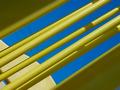
Shot using white typing paper with a black light. Used NEATIMAGE on one try to attempt to eliminate the "noise" but it gave it a very soft look. I really liked it like that, but . . .
Just in case it is not obvious, a play on the phrase "rhythm and blues" and I was trying to show the "movement" of the music.
Statistics
Place: 49 out of 79 Avg (all users): 5.4343 Avg (commenters): 4.8750 Avg (participants): 5.2121 Avg (non-participants): 5.8788 Views since voting: 1184 Votes: 99 Comments: 9 Favorites: 0
First thing first.... GREAT shot! I'm really hard to please when it comes to abstract shots but you succeeded in getting my attention!
THEME: The choice of the subject and its placement respect the theme.
COMPOSITION: I get distracted by the white in your frame. I don't think a frame was necessary for accentuate this shot. I like the chosen angle, it has a tunnel effect which gives it a nice perspective. The choice of colors is great! Black and blue are almost always winners. :-)
Lighting and focus: Perfect lighting! Great tones. The focus is a bit soft but in this pic it seems to fit.
GENERAL: not to be too nitpicky but the rhythm impact would've been better is the tip of the paper wasn't cut out of the photo.
It's a great shot and a wonderful idea. The only thing that really bothers me is the focus, it just doesn't seem sharp enough. The lighting is perfect and the black background just melts into the blue.
Interesting abstract. I don't think I like the framing of the shot. Maybe rotating the shot so that the bottom line of the blue object would parallel the bottom edge of the frame would create a good effect. Currently the visable blue shapes seem somewhat random and don't really have any pattern or form. 4








 Add photograph to your favorites
 Add photographer to your favorites

 Photographer found comment helpful.


