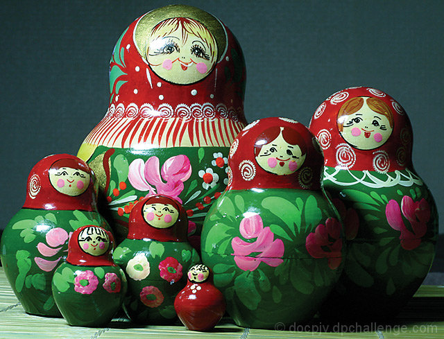
Interesting subject & nice colors. In my opinion the background is a tad bit distracting. The color doesn't bother me, in fact it really helps bring out the foreground colors. Its the texture of the background. It looks like a kodak grey card. A little narrower DOF would have helped. Good Work.
The color cast is a bit off for me. The green is overpowering, and causing a slight hue shift on the reds. You might want to try tweaking the levels a bit. :)









 Add photograph to your favorites
 Add photographer to your favorites


 Photographer found comment helpful.


