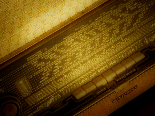
I like the angle. It lends an artsy feel to an otherwise bland subject. I think your lighting could have been much improved on this shot. It's seems too flat and muddy, as though I were looking at the radio through a dirty fishtank. This can be a good effect sometimes, but I think it's not appropriate for this radio. The gold-ish material on the radio near the top-left is a distraction to me and adds little to the composition. A tighter crop on just the "TELEFUNKEN" portion, the buttons and the European stations would have been an improvement. It certainly fits the challenge. I just would have liked a "cleaner" lighting setup. Hope that helps.
Technologically low - Yes. Non-Electronic - Nope. Nostalgic - beyond a shadow of a doubt. I like the diagonal centralized lighting on this piece the angle of presentation, patterns, textures and perhaps even the dust or grain resulting around the push buttons. The text is easy to see, this is a great antique-style foto getting high marks, but has serious loss in the application of low-tech use no electronics.
I like the angle you shot this at, the colors and soft look you've captured. I'm not exactly sure what I'm looking at: either an old radio or shortwave radio, I presume. I think stepping back a bit (or cropping less) might have helped me identify it more quickly. My own views aside, but you are probably taking a beating on this as this is an electronic device (challenge said non-electronic). But it's stil a nice photo (and I scored it well anyway.)
This is fantastic! Love the soft focus effect and the soft spotlight is also a very nice touch. There are a few cities on that radio that I'd like to visit and go back to (such as Munchen). The one detail that bothers me is the lower right corner but I suppose that was unavoidable. You get an 8 from me! Good job!
Nice photo. But a "radiogram" ELECTRONIC. The challenge states "non-electronic" as a requirement.
[edit]
OK. There's a hot debate running in the forums about what exactly is "electronic".
I have decided to subtract only one point for items I believe to be electronic, rahter than the hard-line "1" I originally issued for such items. This is far more fair and reasonable.
The photo isn't cropped right and the color doesn't help. Most import is that you recognize what it is. The color makes that hard, the angle makes it harder, and you are not quite close enought to really read the text. If you had a tighter crop so that some of the text stood out or went with a looser crop to show the whole device, I would probably like it better.





 Add photograph to your favorites
 Add photographer to your favorites


 Photographer found comment helpful.


