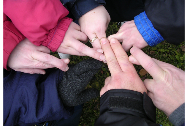
Oh, there it is. I missed the gloved hand for a minute. Interesting photo. It is fascinating how different hands can look. The composition is a bit messy or unbalanced, but you would have to play around with it to see what would be better. Fun idea.
Not sure what I'm counting to get to seven. Flow of the lights and darks leads my eye around nicely. Darks are a bit too dark on my monitor. If you're using photoshop, you might want to use Shadow/Highlight to bring up the darks or levels to make them go away entirely. The eneven half border left and right is a pretty major distraction. Suggest losing the white border entirely. All just my opinion.
Okay, I think this one looks rather unprocessed. Crop off the dead spaces in the periphery and adjust the shadows to bring out more detail and increase the sharpness.
There are 2 white uneven borders on the sides of your entry. A cropping boo boo, or intentional? Hmm...either way, I don't lke them. I assume a crop error... My 4th highest entry has one on the top edge, so you are not alone.





 Add photograph to your favorites
 Add photographer to your favorites


 Photographer found comment helpful.


