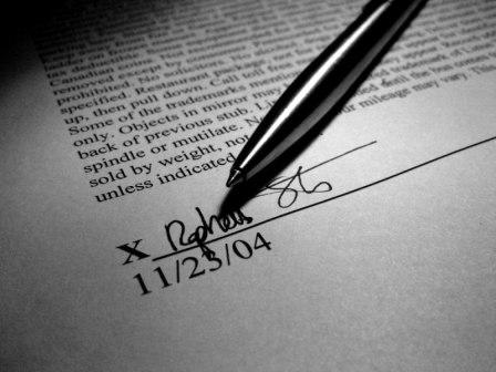
There appears to be what seems like an artificial vignetting effect in this shot perhaps created or accentuated by post processing. Helps to draw focus to the sig. Well done.
the big question for me is, "did you write the text, or did you find it somewhere?" this could have been a killer entry, if you had rotated the signature into the bottom right, and had included a bit more funny, authoritative text (like "failure to comply will result in forfeiture of first born son..."). shallow dof also takes away from inviting viewer to read deeper into the image. keep in mind, scoring here is a matter of grabbing and keeping voter attention, not allowing them to view and click away. all the same, i like your take on the challenge, and wish you good luck.
Very nice composition, and good choice for b/w photo. A recommendation: hand holding the pen might have been better here, as that would have reduced the shadow of the pen on the paper
Nice use of light and shadow. Great clean lines in the crisp focus, letters, and pen. I would have angled the pen from the other upper corner so that the signature was not obscured by the shadow from pen. The artist did an excellent job by choosing to make the letters so clear and tight at the bottom of the page and then sliding out of focus as they move up the page. Outstanding choice of angle for that aspect. Great image.
i lov the grayscale of the whole image everything fits well
1 thing though i am bothared by the sarrifs on the x instead of it looking leagle it kinda seems home done.(should have changed the font for that)
thats all GL,-BC





 Add photograph to your favorites
 Add photographer to your favorites

 Photographer found comment helpful.


