returning for comment:
No way. lol Bumping up to 6. Now, you never wabt to show red eye in a comtetion especially when you have such a nice image. I did not see it. lol
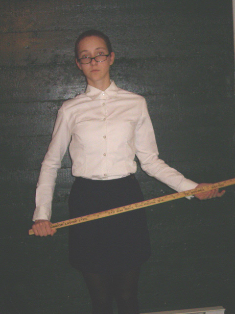
The lighting in this picture isn't very good. The model also has some red eye. I think she may be screaming "Listen to me!" because nobody can see her.
Good subject and idea. Not such a great photo technically. Greater contrast would help. A bit of work with levels would, too. A bit closer or a different crop to get rid of the desk (?) at the bottom. Stronger focus.
Interestig udea, but she's at an angle and there's some sort of haze. I'd have cropped out the top and bottom objects as well. You can avoid red eye by shooting at an angle.
good idea, but low quality pic - looks ,like something from an OLD digital camera. Not well lit, not sharp, noisy. Could use a bit of cropping on th ebottom to remove the white thing (distracting). Model has redeye too.
This image looks staight out of a low-budget S&M porno. Your subject looks a little frightened if you ask me. Angle, framing, and stark use of muted colors enhance the severity of the image. Daring and edgy. If my interpretation is correct, the undertones were intended.
Good idea, but the image overall is washed out and without any "edge". Some assertiveness, or edginess would be great for this subject as it's really set the view back on his/r chair. Good luck...
The most glaring problem is the exposure. Because you upped thebrightness so much without increasing contrast, it just feels washed out. The angle is another problem, as well as red-eye.
Good idea, very poorly shot. Flash has caused red-eye, the image is washed out, the subject should be pulled off the background and more care should be taken for extraneous bjects in the shot (whatever that is in the lower right). This is just a snapshot.
The red eye ruins the photo. Also, you'll need to adjust the levels so the colors aren't washed out. Try an external flash, or another source of light coming from another direction.
Model is appropriate. There are several factors which make this photograph unacceptable.
- Contrast. Lack thereof. This shot could have used a nice boost in contrast.
- Framing. Could have cropped off the distracting white at the lower right corner and upper right corner, and the female could have been shot in front of a more interesting backdrop. A slight rotation clockwise could have improved this.
- Red eye. Under the basic editing rules, this is problematic. I think instead of shooting her face on, a different angle would have been more compelling and eliminated the red eye, to boot.
- Detail. Focus is soft and the resolving capability of the camera is rather dismal. Perhaps a tighter shot would have brough out more details which was lost with this particular composition.
Given these considerations I can't rate this very highly, sorry.





 Add photograph to your favorites
 Add photographer to your favorites


 Photographer found comment helpful.


