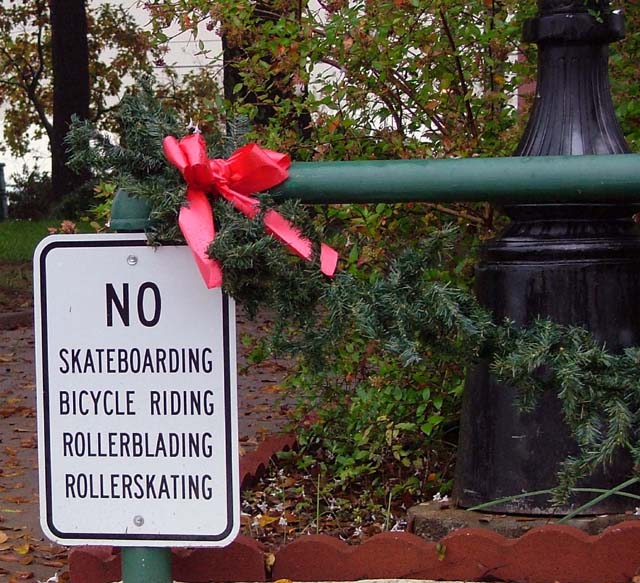
This one made me laugh. I like the paradoxon in the image, and the sarcasm of the title. I'd have preferre a tighter crop on the sign though, leaving just enough of the surrounding to suggest a park. Just next to where the ribbon (hey?!) ends.
this is funny! nice take on the challenge. one thing you might consider before submitting, though, is to true up your vertical and horizontal lines. here, it is a little distracting to follow the tilted line down the edge of the sign. i'll still score this a 6, but will also say that attention to the little details that you have control over can make a world of difference with the voters...
is hate those signs. we used to just put skate stickers over the word 'no.' then it looked like it would say 'skateboarding permitted' ah ha we were so clever. i like this shot with the decoration and such...nice sarcasm






 Add photograph to your favorites
 Add photographer to your favorites


 Photographer found comment helpful.


