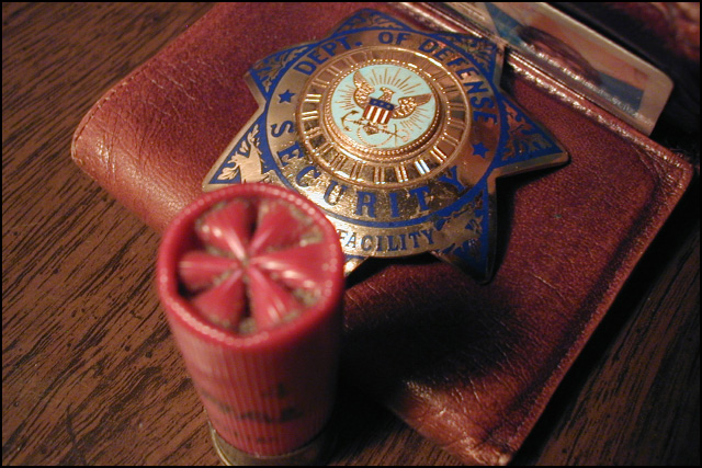
DoD badge and a 12 ga. shotgun shell with my wallet.
Incandescent lighting, handheld in macro mode, Exposure compensation -1/2 eV. Resized with IrfanView and cropped with Photoshop; no other adjustments. Added 2-pixel black stroke to bring file size under 150kb at JPEG=8/10.
Statistics
Place: 87 out of 149 Avg (all users): 4.8495 Avg (commenters): 5.4444 Avg (participants): 4.8375 Avg (non-participants): 4.8543 Views since voting: 1258 Views during voting: 388 Votes: 279 Comments: 13 Favorites: 0
Hey Paul; just want to know that this remains a very strong image. One of the few that impressed me.
Thanks.
I had two purposes in positioning the shell in front. Mostly it was to obscure part of the type on the badge -- the the type was supposed to be readable, showing that part would have diluted the effect.
Afterwards, I decided I also liked the was the round, crimped top of the shell mirrored the shape of the Seal.
I had no intent to attribute this to the Bush (or any other particular) Administration -- that badge is the only one I happened to have around. If I could have gotten one which said MI-5
#007 believe me I would have used that instead!
While "police" authorities do not (in the USA) have the right to go around shooting people indiscriminately, there's ample evidence to show that they do shoot people discriminately, and are rarely punished for the resulting homicides, even when they involve the death of unarmed suspects or innocent bystanderd
returning for comment:
Very nice composition because of its simplicity. A deeper dof would have enhanced it more. Yes, I realize the badge is the center of interest, but when you place a blur right next to the center of interest it creates a constant pull of the eye. If this could be made to work be separating the cartridge it would help. However, your effort here goes beyond the placement. The selected items are great and the color very convincing.. Bumping to 7
I think that you could have had a better picture if you hadn't put the cartridge in front of the badge as it suggests that the gun has a higher authority than the holder of the badge.
Even though it's out of focus, the sheel is so large that I feel like I have to look over it to see the subject. Instead of complimenting the picture, it dominates it.
Title ruins the shot. It's ot a license to kill, a police officer can not just walk around and shoot & kill people just because he has a badge. You want the title license to kill perhaps you should have posted a photo of a hunting license, that's a license to kill. The photo represents authority, the title doesn't -1 for the title, 2 for the quality of the shot, badge is slightly out of focus, the shotgun shell should have been placed in the back not in the forefront, especially since you focused on the the badge, the blurry shotgun shell is distracting, takes all of the attention -1 + 2 = 1
the oof shotgun shell kills the composition. maybe if you had laid it on its side and backed off just a bit? the colors and lighting are nice. this is definitely one to revisit.





 Add photograph to your favorites
 Add photographer to your favorites


 Photographer found comment helpful.


