Meeting the challenge: I think this is an excellent theme for the challenge. For time is the final authority.
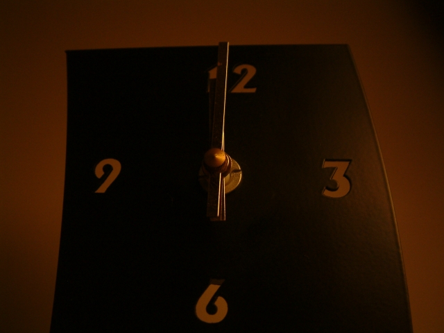
Lighting: I feel that the lighting hurt this shot pretty badly. It is just to dark. While I see the reason and mood behind the dark and gloomy lighting I feel it was over done. Perhaps a strong light coned down to het smaller towards the top of the clock would have worked realy well. It would given the clock an illusion of being taller. I brighter light also would have brought out more details in the photo.
Composition: I like the way this shot was set up. The clock hands set on midnight. The angle you took this photo from was also excellent. It gave the clock a taller more dominating look. However the overall angle of the shot is a little off. Try rotating the entire photo 1 or 2 degrees to the right.
Technical: Poor lighting. the focus was good from what I can tell. I feel the choosing the center of the clock hands was a good choice for your center of focus.
Artistic opinion: I like this shot from an artistic stand point. Very "message" heavy. Decent balance, and center line. The brighter lighting would likly have given this alot of colors to enjoy.
Overall: this is a shot with a lot of potential. Fix the lighting and this would have been far more interesting a photo. I think your score easily could have been 5.5 or higher with just the better lighting.
Ain't that the truth. As for the photo, I think it's a little on the dark side and the parallax is a little distracting, not too bad though. One suggestion for added interest would be if you placed the hands at something other than the same place. A 7 from me mostly for the message.
Oh, I so agree with this concept. I considered this idea, but decided on something else. I would like to see the brightness up a bit and the angle of the shot squared up since time is so linear and unforgiving. Great point of view - looking up with time looming over the viewer.
You've obviously chosen to have a very low-key shot. I have to say it doesn't work for me. The clock seems rather awkwardly bent, which is distracting. The basic choice of composition is good, central and balanced, but with the curve of the clock, the compoistion is lacking.
a little on the dark side. cropping is a little uneven, as well. while i can recognize time as a form of authority, all i see here is a snapshot of a clock.





 Add photograph to your favorites
 Add photographer to your favorites


