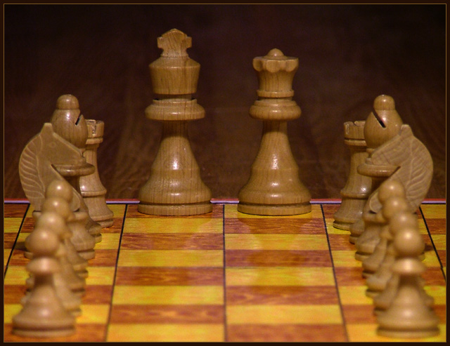
An interesting and different view of the chessboard. I'd have changed the order of the other major pieces to be Bishop, Knight, Rook, and then Pawns, both for the descending height of the pieces, but that's also their "natural" order as well.
Nice variation on a cliched theme. If it were me, I would raise the camera slightly to lower the board boundry inthe frame. I tend to like shallow DOF but I have learned DPC voters do not. A sharper focus and greater DOF would help, I think.
Nice idea. The use of color and the framing/composition work very well in this photo. I like the soft focus on the pawns and the crisp focus on the King and Queen.
Having the pieces laid out in such a non-traditional way really draws attention to the formation you've got going on there. And the formation indicates authority/respect nicely, I like it!
Nice idea. You might have put the figures closest at hand a bit more to the side. And adding some more (yes, you'd need another set of figures) would have made the idea of a corridor leading to the king&queen even stronger. Nice idea though, how two figures can dominate a whole game.
i'm not quite sure what this needs, but as is, it just doesn't grab me. i can't tell if it's the lighting, the shallow dof, or the colors, but something is just not working, especially as far as communicating authority.





 Add photograph to your favorites
 Add photographer to your favorites


 Photographer found comment helpful.


