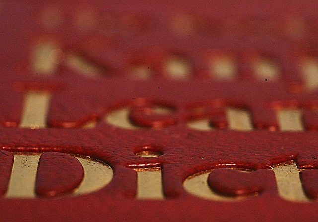
I hate the dust spots on my sensor. How I wish that basic editing would allow these to be cloned out. A smaller numbered f-stop would have helped but wouldn't have given the desired dof. Too bad. My aim for this shot was to show the height in the lettering.
Statistics
Place: 119 out of 149 Avg (all users): 4.5739 Avg (commenters): 4.3846 Avg (participants): 4.5122 Avg (non-participants): 4.5990 Views since voting: 905 Views during voting: 379 Votes: 284 Comments: 13 Favorites: 0
first impression: interesting take on the challenge. second impression: oh boy, that sensor needs cleaning. third impression: the image is ok, but i doubt if i would have gotten it without the title. while i can find it visually appealling (lovely colors and rich texture, interesting angle), the dof is just too shallow. this might have worked if the book had been pushed slightly away from the camera, so that all of the letters (top and bottom) were in focus. as is, it leaves me feeling that this is an image in search of a subject.
Interesting idea. Great contrast in the textures of the part of your iamge that is in focus. This almost works for me, but not quite. I am not sure why, but I think may be because Dictionary is cut off at Dict, and that is the word I see. It blocks the image of dictionary from coming through for me. Perhaps a different cropping would work more effectively.
I'm trying really hard to see the link to authority if I don't consider the title. Do you mean that it is possible to look up the word 'authority' in a dictionary? That would work with any challenge, then.
The depth of field is nice. The gold letters don't come out too well, they should be brighter. Now I don't know how you managed to get those black spots in the middle of the picture in there, but they're annoying.
I still don't get the link to the challenge. Sorry.






 Add photograph to your favorites
 Add photographer to your favorites


 Photographer found comment helpful.


