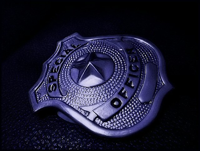
I like this image. Nice use of lighting and color. I would like to have seen a more creative cropping/framing, but the angle is creative and aligns with the star in the center of the badge so it does work.
while i can get what you're shooting for, i think the execution could be a little stronger. if you had rotated the badge another 10-15 cw, leaving the lighting the same, i think it would be much more dynamic. as is, it looks like a badge, laying on its side.
[not that it matters to me from a voting standpoint, i think the title could use a little work as well.]
The angel of presentation makes this difficult to read. I like the tone, but the incomplete isolation is distracting. There are a few spots where the reflection from the light may be a bit too harsh, perhaps a more diffuse source.






 Add photograph to your favorites
 Add photographer to your favorites


 Photographer found comment helpful.


