Challenge:Authority (Basic Editing I) Camera:Nikon D70 Location: My House Date: Nov 22, 2004 Aperture: 5.0 ISO: 200 Shutter: 1/125 Date Uploaded: Nov 22, 2004
Again, another thank you to all of you that have replied since the challenge. Even if only one person understood what I was attempting to do, that would be enough for me to know I was on the right track. I appreciate all of your inputs, and would even say to those that wanted to do a daring picture to do it. This site is not only about ribbons, but about growing as a photographer to meet challenges by using your imagination, talent, and eye for several situations...Dare to be different crowd!
I don't think the focus is on the belt... so small hard to see really.
Well you are right art is not only about showing what people like. Don't worry recently I read about a photographer that showed gays in his shots. This man is a famous approved artist and well people came to see his work, but many didn't like it. The fact remains they did come to watch. Afterwards the authority banned his work in this gallery - not exactely sure what the story really was but the trick is to do what you want to and don't let other people "bend" you.
I however chose another path :) First I want to get to know the tool "photography" so that one day I will be well equiped to show what I want no show :)
I love your atitude. I wanted to do something simillar but I was not sure if my shot would have been understood. I am not aware of what church problems are there in America or Asia :)
I wanted to show that the church forbids contraception ( is this the word? :P ) The idea was to place a shot of a priest in a frame and a condom leaning over it :). I gave the shot an 8 because I liked the way it was made, but I don't like the connection that the act it depicts is any kind of authority. Not to me. It's brutality and worse. No human should live through something like this.
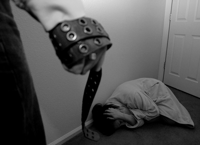
I really thought this photo was one of the most interesting of the bunch. Unfortunately the focus, as stated earlier, was not on the woman, but rather on the belt. Still, I think this deserved a better score (I rated it a 6).
I think it's a real shame that this photo got all those ones, twos, and threes. The point of good photography is not always "feel good" images - sadly lost on so many here at DPC. This should have been a top 10 in my book.
First off let me thank those that supplied a useful comment as opposed to the Beavis and Butthead comment of "this sucks". I appreciated that. Secondly, I am glad that this raised such a conversation piece, as that was what was intended. I wanted to portray what man has done physically in the past to hold down women, and what they do today mentally to maintain that power. For those that got defensive about it, you missed the boat. I gave me in this photo...This, unfortunately is how my childhood was with regards to male authority. I believe that because of this, I was able to share myself. I didn't care how well I did in this challenge, and that was never the point. The point was to reflect my life. I am happy to say that I don't follow these traits, but it still does occur. Anyway, look for more daring photos to come out of me, as I am not afraid to push the emotions. Photography is personal for me and not just an aesthetic entity for the sake of a ribbon. Art rarely is. Thanks again!
Damn! This evokes an emotion...that's for sure. I think a tad more contrast would help. I like that it is rendered in black and white. Powerful illustration! [I hope it's an photographic illustration! :::shudder::]
This makes a powerful statement. I don't really care for the blurry forground and I think the image would have more impact if you could see the woman's face.
Yikes, very disturbing photo...powerful image of something that happens way too frequently in the world today. B & W adds to the atmosphere here. Well done. 10
I love where you placed the focus - on the woman cowering before the authority of her attacker. While the subdued lighting works here, I just wish it weren't quite so flat. Nice job!
Disturbing photo. Dark cast adds to the mood. I hope this was a set shot, because domestic violence never conveys authority, it only conveys fear. Authority is never taken, only given.
The angle and point of view certainly capture the feeling of the cowering woman. As a woman, I am uncomfortable staring down at the woman. I am sure that was intended. Since you are using it as a key element, I want to see the belt image tight and crisp. The woman should be even more out of focus because her abuser doesn't empathize with her pain. Since you are putting me in the position of abuser by your choice of point of view, I should see the woman as nonhuman as her abuser would. Daring photo. I appreciate your courage and your willingness to take a risk.
Very strong message here. I like it. Only thing I would have done was brought up the brightness just a tad on the woman. Not much though... you still want to keep the 'dark' mood in there. Very good choice on focusing sharp on the woman. 8
I'd have given it a different title. But that's not so important. The composition is nice, I feel like the watcher of that scenery, which makes me feel unconfortable, and that's the best part of this picture. The woman crouches in a corner, clearly tries to protect herself, and the way the man holds the belt clearly shows his intentions.
A bit mor light would have made the details come out nicer. The guy's hand is either too blurred or not blurred enough. The crop is perfect. You might have taken te picture in the other side of the corridor. Having the doorknob in it would have brought in an additional element: a possibility (the only one) to get away.
Really powerful image. I don't like looking at it, but that makes it good and effective. As for the technical merits, I think it could have used some levels/contrast adjustments as it looks a little muddy to me. 9
Disturbing shot... Very heavy and daring. I'm wondering if it would've been bette to focus on the belt (tool of authority) rather than the victim. Not enough contrast to my taste but a nice (if I could say so) composition.
Social commentary... ok. Stepping aside from that, the image has no sense of location or situation.. Without more of the context, the message flass a litle flat. technically, I think it's all right, but the tones are a little flat. I don't know, in this case, that black and white, without heaps more contrast, adds anything.





 Add photograph to your favorites
 Add photographer to your favorites


 Photographer found comment helpful.


