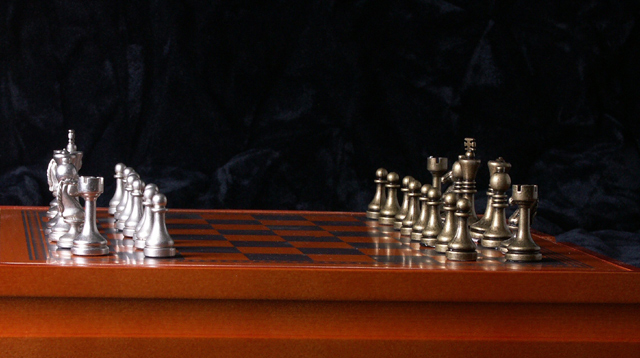
The image is well lit and very crisp. The background is not distracting despite the uneven flow of fabric. It seems very far away, I feel removed from the game and the low camera angle adds to my separation. The downward slope of the board is uncomfortable and terminates too far from the frame edge. This viewer's perspective does not place a chess set or board games into the technology realm although I understand there could be an implied link to the technology of video games and electronics in general. A tighter crop, (enalrgement of the main subjects) and a slightly higher angle of camera or change in the angle of the board itself would greatly improve the viewing of the set and the overall impact.
Pretty good entry. Only a couple things: I think the height angle is a little too low and the side angle should be parallel to the horizon - makes me think the Silver team has the advantage of gravity. ;-) There's also a little distracting ghost in the black background.
The lighting is very nice , the colors are very deep and rich. One biggie is getting the vertical and horizontal straight and that is the first thing that caught my eye here...the horizontal in not crooked.
There are things visable in the background that are very distracting, maybe they could have been cloned out. Also the board is not level, it would help to rotate it. The lighting is good.







 Add photograph to your favorites
 Add photographer to your favorites


 Photographer found comment helpful.


