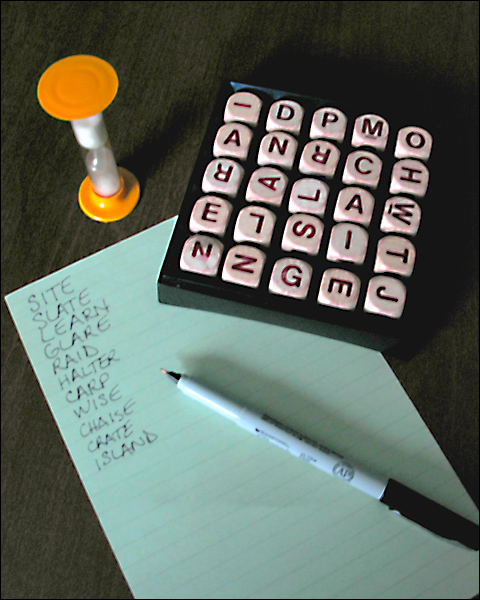
Most have gone for a sense of the slow movement of time - I like that you've chosen the idea of time pressure instead. The composition is very nearly too busy - though I think you get away with it, just. The poor image quality (white balance, focus or processing making it fuzzy, sharpening halos, odd colour artefacts around the letter dice) really lets it down I feel - can't see an effective point of it.
Ok - it BOGGLES me how you came up with this idea so LATE in the challenge, but you deserve PRAISE and I can't WAIT to hang this on my WALL once you put it up for SALE. sorry couldn't help myself. ;-)
Good concept, I am a boggle fan :) The focus seems abit soft and the lighting on the pen is harsh. I would try repositioning the light and putting a thin piece of white cloth over it diffuse it a little.
It is either out of focus or (which I believe is more likely) you used some effect on it, which imo didn't do a nice job. Plus the picture itself doesn't really attract me.
Nice composition, but image is very soft and poor lighting has left this struggling to retain definition without noise. You'll probably get tons of 'out-of-focus' comments.






 Add photograph to your favorites
 Add photographer to your favorites


