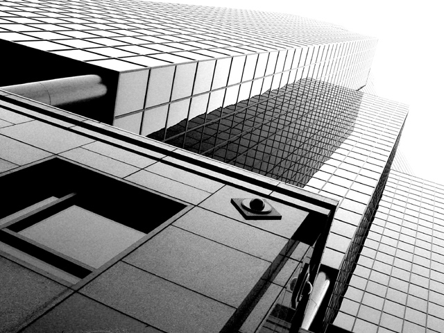
This photo makes me want to tilt my head to adjust to the perspective of it, the photo forces me to rethink perspective. I feel maybe it is a little too light at the top, though you might have been intending that, judging from the title. Good focus. I like your choice to make it a black and white. Overall, I think you didn't get the score you deserved, but not by much.
I really like it that the left side of the building is horizontal in the pic and the right side is almost verticle. Excellent perspective!! And the lighting is very nice also. 9.
I like this picture's perspective so it matches the challenge well, but seems to me that the artifacts are a little too noticeable. Maybe too much USM or just a nasty side effect from the squares.





 Add photograph to your favorites
 Add photographer to your favorites


