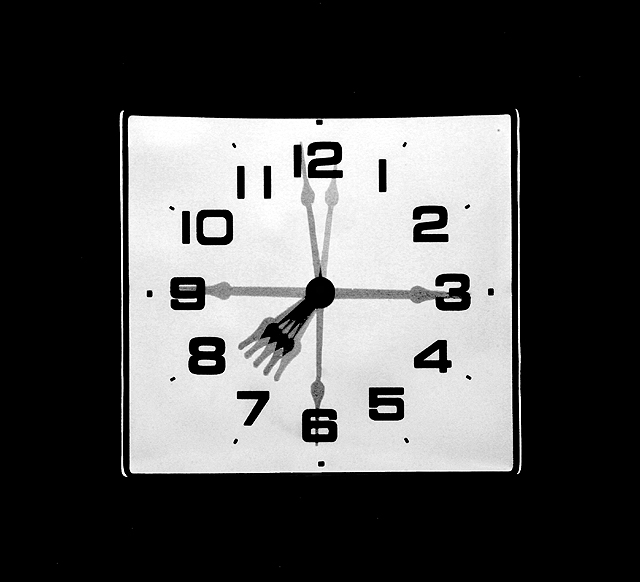
This is an interesting shot. It meets the challenge without a doubt but there is something about it that both fasinates me and bothers me. It's well done, the composure, the clarity overall but there is touch of graininess that seems just a bit, a very little bit much. Also the negative space around the edge seems a bit much to me. While the subject is well centered and certainly draws your attention because it is brighter than the rest the large amount of border or black space ends up being a distraction to me.
The color of the white on the clock face seems a bit dark also and yes, my monitor is calibrated. I think if it was a more sharp contrast, brighter, popped out more it might have done a bit better.
Almost non-pnotographic in its quality. The overlap of the hour hand is intriguing. I like it, I like the bordering and presentation generally. Neat, and controlled.
B&W works really well on this shot. Nice, simple composition and it makes you think about the shot more than the other clock images in this challenge. I like it. 8th hour...8!







 Add photograph to your favorites
 Add photographer to your favorites


 Photographer found comment helpful.


