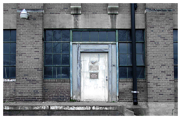
Very scarry building with a lot of warnings on the door -- I cropped, rotated a bit, USM, adjusted hue/saturation to dim bricks and keep the wacked coloring of the door and surround. Added a border.
I hope I conveyed the feeling of the building in the photograph -- the building definately commands authority when standing infront of it as if saying not to enter.
Statistics
Place: 103 out of 149 Avg (all users): 4.6949 Avg (commenters): 5.8571 Avg (participants): 4.4568 Avg (non-participants): 4.7958 Views since voting: 1153 Views during voting: 389 Votes: 272 Comments: 7 Favorites: 2 (view)
Scary concept. I would have liked to been able to read the signs, so I would have cropped this closer and maybe had a face looking out from one of the windows to up the intensity. I was almost afraid to look too closely at the windows for fear that that is precisely what I would see.







 Add photograph to your favorites
 Add photographer to your favorites


 Photographer found comment helpful.


