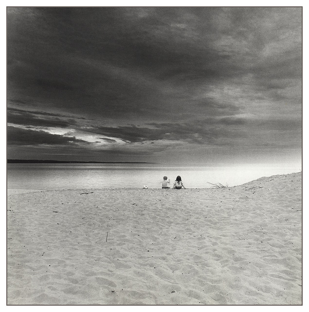
Hey Green. I have always enjoyed your photos, but in going back and looking over some challenges I didnt paticipate in, I saw this shot and just had to comment. Absolutely excellent image. Love the b&w, the grain, the mood, the relative size of the subjects as well as the overall composition. In contrast to some other opinions, I like the composition as is. By leaving so much of sand at the bottom of the image, you balanced the 'earth' with the rest of 'the universe' which help to accentuate the smallness of mankind in relation to both of these concepts. Wonderful image, please keep 'em coming. You are quite gifted. md
I didn't vote last week so this is the first time I've seen this shot.
What an excellent take on the challenge and a perfect title, it really does put things in perspective. The children are the perfect size - just big enough to make out, and small enough to carry the point across. Genius. And those clouds are stunning too.
I'm glad to see this did so well despite not being the obvious interpretation of the challenge. Well done.
Lucky me... I get to critique my favorite photo from the challenge :)
I found this photo to be quite inspiring. Where perspective is concerned, I really like your approach to the challenge. The small children in this photo give 'perspective' to the vast land/sea/sky scapes shown in your photo. Your choice of black and white really enhances the entire mood of this photo as well. The theme could be somewhat 'sinister' in a way but, with your title, it sort of puts mankind into perspective with everything :) I love the entire composition... I can't offer you any ideas for improvement because I woulnd't change a thing...
I was hoping this picture would've take the 1st place. I agree with the others, that you could crop some of the bottom of the picture. It improves your composition. Try it using the scrollbar on the browser's window. Congratulations!
I just love this picture! It is one of my two favorites of the challenge. B&W is great. I also like the grain in the picture, it adds a feeling. This is a beautiful shot by itself, but adding the two children is what won me. Very beautiful. Good luck in winning the challenge!
I just love this. I don\'t know what to say. There\'s nothing I would suggest to improve it. It\'s a great work of art. This is one case where large size works and doesn\'t make the image difficult to read. 10!
I feel quite small when I see this--strong sky--good texture in the sand and a lovely overexposure coming from the right-the focus of attention is the children--well placed--a lovely composition.
I like your take on perspective and this is a great image. I would have cropped it midway through the sand on the bottom. I think this photo would have better balance with the horizon at the bottom third of the photo. I don't thinkyou would loose the expansive feel of the image with respect to the children, even corpped tighter on the bottom.
This is an excellent photo. Because it is so good, the only things i'll say in this comment are small nit-picky things.
I think the children should be centred. I think this would help the composition more than them being slightly to the right. I'm also not so keen on the washed out white area on the right.
I think overall this needs just a little more contrast throughout the photo, to add to the high dramatic feeling this photo already gives.
Changing these small things would get you an 11 if such a thing were available, but have a 10 for now.
One of the best composition I've seen on this site in a number of months that I've been a member, great tonal range, the sky is perfect. Too bad we have to comply with the current size limits. Great job, congrats!
I wish I could have taken this. Dramatic effect is top notch. BW is great. In my pics for the podium. 10. I hope the "I hate kid pictures" trolls don't notice the children.
This almost has a surreal feel to it. The desolation... it gives off a sad alone feeling. The b & w, noise, and perspective makes this a very unique interesting shot. - xertion
Very nice. I love the feel of this picture. One thing: I'd try to set the horizon either higher (to highlight the sand), or lower (to highlight the beautiful tones of the sky). It's a toss which one I'd like the most. Nonetheless a very nice picture. Makes me dream of the beach. Jacko 9
My absolute favourite this week and one of the best for weeks. Great composition. Perfect in b&w. Marvelous sky. Good focus and contrast. Hope you win. Good Luck!
I just can't take any more Waldo pics so I'm coming over to the members challenge to treat myself. This is gorgeous. I think it'd look really pretty if you hand colored it and printed on watercolor paper. Gorgeous.





 Add photograph to your favorites
 Add photographer to your favorites


 Photographer found comment helpful.


